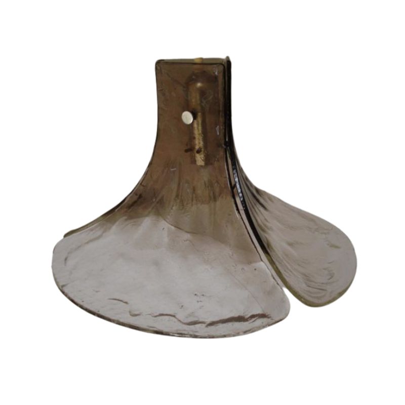
This is a good example of bad design
part of what makes good design is 1) the look, and 2) the usability.
Some designers go off the deep end with their outrageous design without even considering how easy it would be to use.
Over the years, the Museum of Modern Art has seriously considered both of these issues in handing out their "Good Design Awards", and this puppy doesn't have the first chance of being considered!
It's like some (not all) of the Italian lighting of the late 1950's and early 1960's; some of them are beautiful looking design that is totally inpractical as everyday lighting.
Those that really is practical AND beautiful sell and remain in production; the weird, wild ones get discontinued within a year or so.
If you need any help, please contact us at – info@designaddict.com


