Wow Riki!
Thank you for taking the time to do that wonderful drawing! I'm impressed and inspired, seriously. I am going to do some furniture rearranging this weekend to test it out.
Actually, when we were reorganizing the living room, I made little cut-outs of our furniture on graph paper, to scale, and then played with them on our graph paper room drawn to scale. Having a chair near the main entry seemed problematic because there's actually only 2 feet of space on the entry wall before the entryway begins. Nontheless, it could look ok and your drawing has inspired me to try some new arrangements.
Of course, I know we will struggle with not having everything focused toward the TV. Much of our time is spent in the living room with the TV on, even if working (we probably watch to much TV). Even when we entertain, half the time it is focused around some sports event so we have to consider guests' seating. Then again, maybe I just reorient the chairs on those few occasions since we usually pull out additional chairs and clutter the space anyway.
Thanks very much Riki - radical re-think indeed, along with a professional drawing! (This is why I have a day job...).
Excellent thoughts!
Guy in SF, you raise some very thoughtful points that I hadn't thought of.
For example, it may be worthwhile keeping the womb light color when we reupholster it, which is something I hadn't really considered (The upholstery is terrible because it has been the dog's chair for the past few years - that cream cotton upholstery is no match for our 50lb dog who stands on the arms and buries her treats in the cushion...soiled and shredding in parts). Thank you for explaining color value - again, not something I had thought of in that way at all.
Question - if I end up keeping both chairs, do you think light upohlstery for the Womb would clash too much with the values of the sofa and Papa? If all three pieces are kept in the room is it be better to keep the color values less contrasted?
Cloudburst, if you were to reupholster the sofa, would you make it lighter or darker? I ask because while the Papa is newly reupholstered, we may have to do the sofa in the next few years - upholstery is original from the mid-1960s and I love it, but there's some hardening on the framed part of the sofa.
I really would like to keep the Papa bear in the living room, if possible, since it's the comfiest chair (and I agree with Tulipman that it's too important to exile to a side room - and we actually don't have a place for it - our den has these tiny, very, very low Michel Mortier chairs which make even most MCM furniture seem gigantic in comparison).
BUT, GuyinSF, I totally hear what you're saying about the womb being complimentary to the sofa - I will definitely keep it in mind as I rearrange this weekend.
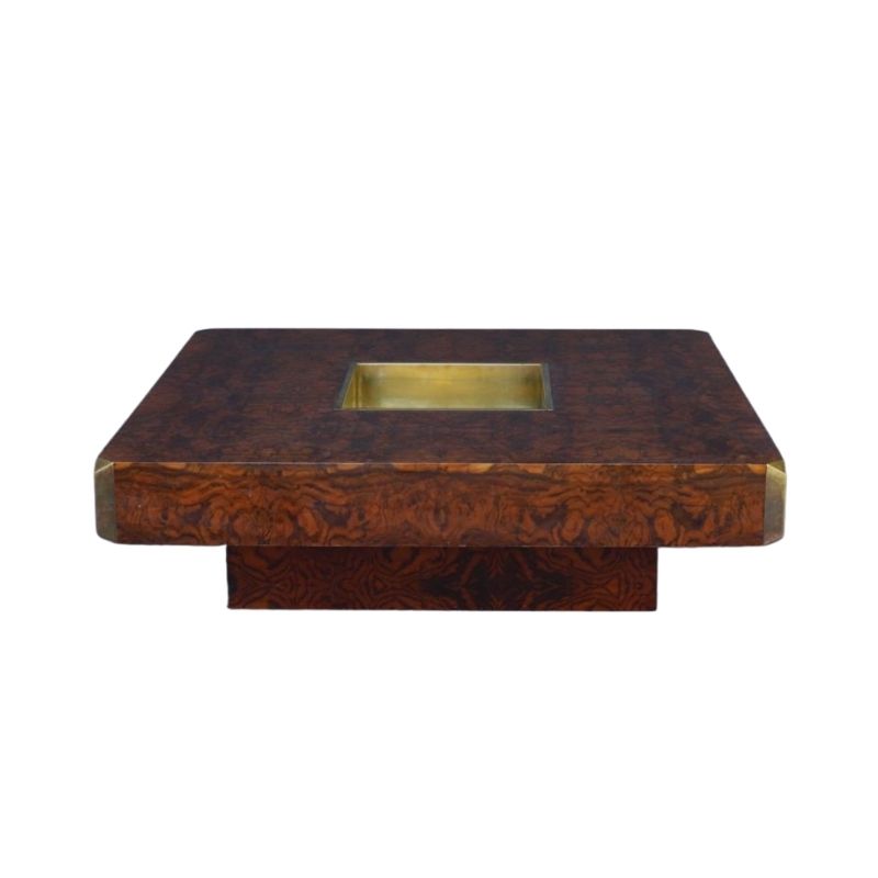
And you have a good point about not getting a wood side/end table unless it matches the coffee table - I knew there was something that concerned me about the proper end table and you put your finger on it. I may well keep my eye open for a tree stump, or maybe Riki's suggested Eileen Gray table...
Again thank you so much for taking the time ot share your thoughts.
This really is a great place and I LOVE hearing all of your opinions - especially the differing opinions as it's very thought provoking.
Hi Sterling
Yes I do think t...
Hi Sterling
Yes I do think that having a red sofa (or orange) with a dark brown Papa chair, cream Womb and blond coffee table will make your color scheme quite busy. However we have not seen these items together, maybe it will work, you never know. Cream, brown, red and blond wood together don't sound all that bad to me.
Sure you can keep the Papa in the living room because it's the most comfy chair and yes I agree with you it is the most comfy chair in the world IMO! Maybe you should buy its matching ottoman to complete your set so you can be even more comfortable with putting your legs up! Move the womb into another room and reupholster it or at least move it to the opposite side of the sofa.
Also, I'm picturing a large cream shag rug to replace the cowhide. This might solve the problem of the papa chair being too dark to be next to the red sofa. The shag rug will possibly diffuse the off-color energy between the sofa and the Papa and bring the contrast that you need. The problem right now is the sofa and the Papa chair are both dark and your hardwood floor also has a similar color value so everything is becoming "muddy" (not literally) if you know what I mean. Having said that I don't know how good a blond wood coffee table will look on top of a shag rug either so you might have to go with a coffee table that is not blond wood, maybe a walnut to match the Papa. My personal rule is to at least have 2 items in the same color family.
Here is the layout with the...
Here is the layout with the shag rug I was talking about. See how it adds contrast to the red and brown of the sofa and papa and diffuses your attention away from those 2 pieces being non-compatible in color, cuz now you eye is focusing on the contrast of the rug and those pieces instead. If you're still thinking of keeping both lounge chairs in this room then separate them with maybe a LARGE drum table that has the same wood finish as your coffee table, whatever you end up with. The drum table needs to be a fairly large one, not a small side drum, so it acts as a table for both lounge chairs and it contributes to being a divider from the other room.
With these pieces are you basically keeping a somewhat monochromatic scheme from light to dark within a relatively similar color family (cream, blond, red/orange & brown).
Maybe switch the positions of the 2 chairs so the womb is next to the sofa so the order of the pieces goes dark, light, dark. But it's still ok as is though.
I'm pretty sure my scale is a bit off but hopefully this layout will help you visualize a bit, even if it's not with these particular pieces. Good luck!
I do prefer guyinSF's design...
I do prefer guyinSF's design of the womb next to the sofa over the papa bear chair. It gets the two darker colors away from each other. I just think the space looks a bit crowded with both chairs there. Perhaps moving one chair out of that area is best. I know that everyone is saying move the womb and leave the papa bear chair, but they are assuming that you spend most of your time in front of the TV. Do you read much? Is there a place in the house where you have a 'reading nook'. If so, I would put the most comfortable chair there...which is the papa bear chair. It's a great reading chair. If not, and you spend most of your time in the living room and that's where you read (if you read in a chair), then keep the papa bear chair there. I have a separate area where I have a reading chair and I like to have the most comfortable chair there.
In terms of color, I like the pop of color that the sofa brings, but you can always bring in the pop of color in another way. I had a really bright sofa but couldn't get the color to work with the chairs I added (which were newly reupholstered when I got them). So I reupholstered the sofa to a tweed that has a tad bit of orange speckling in the in the greyish-brownish tweed material. I replaced my brown and white rya rug with a rya rug with brighter colors. So my seating is a bit more nuetral-toned now and the flash of color comes from the rug. Kinda the opposite of what guyinSF was suggesting. I like white shag rugs (aesthetically pleasing) but they are a major PITA to keep clean (keep that in mind)...especially for a high traffic area. They like to collect everything and it shows up since it's so light-colored.
You have skillz!
And GuyinSF, you made my husband's day endorsing a light shag rug - that's what he has wanted all along, regardless of the furniture arrangement. I also love the look and the coziness. I'm sure it would be a PITA to keep clean; on the other hand, the cowskin is a PITA to keep flat and unwrinkled...
What do you think about an oval shaped rug to define the pathway from the entry around the living room? We had a rectangular rug, and the corner in front of the entry definitely took a beating since you had to cross it; my thought was that an oval would "direct" one to stay on the wood floor - but I don't know if adding an oval shape would also add visual clutter.
I love the idea of contrasting with the rug though. The only thing we can probably afford to upholster right now is the womb since it needs it to be presentable for guests - if we had a light rug, I'm guessing we could change the womb from cream to some color (I like mustard or brick... but I'm no expert) and it would work if the theory was to contrast furniture with rug - is that right?
Cloudburst, I see what you mean re womb next to sofa. We had played with that configuration and I liked it because it filled the corner nicely and the ottoman wasnt floating around as much. My only concern was discrepancy the arm level of the pieces - the Womb's arms are 20"; the sofa's are 26"; the Papa's area 24" at the tip. I might have had them to crowded and close, however, which would have highlighted the height discrepancy. Or maybe that's not as a big a deal as the overall shapes working together?
As for reading - it's sad but I no longer read much. I spend 10 hours a day reading for my job, which has made reading for pleasure is less enjoyable. My relaxation is either in front of the TV or outside walking with the dog (depending on weather!).
I like the drum table idea too. So many possibilities, yet also constraints. I'm going to play with the furniture this weekend (and start looking at shag rugs...)
Thanks!
If you need any help, please contact us at – info@designaddict.com


