Impossibly framed livingroom
I understand a bit of your pain. Although, after some jiggery-pokery, I've made my room work well. I have a fireplace on one wall, the TV on the opposite wall, a killer view to the Ortiz Mountains (Santa Fe, NM) on the third wall and the dining table against the 4th wall. Add to that we have to walk between the sofa and dining table then in front of the fireplace and then the wall with a view to get to the office and 2nd bathroom. So trust me, I get'cha, Sterling.
Since the womb looks so damned fantastic from all angles, what's wrong with seeing the back of it from your entry? I don't think I'd mind that, if it t'were me.
And as for a foot rest for the Papa...seriously, upholstered phone books is not really a totally insane idea. You might also think about just a block of wood. An offcut from a big beam. Methinks that might be moderately cool!
As for the Nelson as coffee table. We use ours as a front entry bench for the on/off of shoes so that's not an issue for us, but putting a tray on it would be A-OK in my estimation. But the top is perfectly flat and the slats are tight together so it likely would be fine just as it is. There's always a sheet of glass as an option as well.
Wow, great responses!
Thanks so much. Although I've been reading DA and lots of modernism books for a while now, I am still a relative newbie. For example, it wouldn't have occurred to me to put a smaller round or amorphous table in front of the couch, so these are good to think about.
And the pix are finally coming through on my computer!
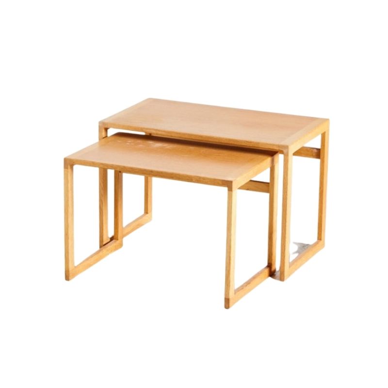
Norm - thanks for the pic! That is a nice, simple table - with storage as a bonus. I don't think I've seen that one around in my recent searches.
Fastfwd - great pieces!! Ah, I see your attraction to the ETR now 🙂 I too like the low height for footrest... But it's less useful when using as a working surface because it's low. Hmmm..
Olive - I like your idea of a block of wood - I had actually looked on eBay for some cross sections of petrified wood that were a few inches tall since I thought it could look cool. Still an idea - I think wood would look ok.
As for my impossible living room, I made it sound better than it is. The entry way is actually perpendicular to the couch, so putting the womb opposite the Papa would entirely block the entry.
Heath - speaking of wood, yeah, I thought about Nakashima too - but then those uneven surfaces might wreak havoc with my oft-present wine glass. Maybe I'm just too picky! There are some very nice pieces though, and the look would be right.
Woodywood - thanks for the link! I'm extremely tempted because it's a great price and it's right here in my city! I like the expandable idea. What are your thoughts on whether it is too "blocky" for the other pieces? (ends in 40 minutes!)
NickR60 - good perspective - thanks for sharing because I had not thought of it that way, I was thinking "smaller/shorter = out of scale".
Finally, does anyone have any opinion on the Brown Saltman tables I posted originally? Just to see if they're still in the running?
Thanks so much for all your thoughts!
Nice Furniture You Have!
First of all your sofa is beautiful! Where did you get it?
I don't really know which table to suggest to you but whatever it is it needs to echo the long lines and form of your slick sofa! The long Nelson bench is not a bad choice but I have never been a fan of its base/legs.
As for the womb and the papa chairs I would separate them in different rooms or at least opposite sides of the sofa. It's a bit too much for both to be next to each other and they don't really compliment each other, they are both fighting for attention and they are both big imposing pieces. Even of you put the 2 chairs in opposite sides of the sofa you're going to end up with a very busy color scheme, red/orange sofa with dark and light lounge chairs on both sides and a blond table, think about that.
Also the coffee table could be something contemporary so your living is not mid century modern overkill.
Thanks GuyinSF!
Thanks for the compliment! The sofa (and the Papa Bear) came from a local store here in Long Beach called Xcape - they are great and we're lucky to have them a mile from our house. It is by George Kasparian, a California designer although beyond that I can't find much on him.
Good point re not going overkill on the MCM. I was thinking about perhaps a non-MCM side table between the two chairs, or perhaps a simple wood pedestal, polished tree stump, or a plstic piece (Cube?)...
I totally get what you're saying about the chairs competing. Here are the problems I'm having with the chair situation (creative thinking is welcomed!):
1 - Given the framing of my living room (see crude diagram below), if I want two chairs they have to be together. So it's either get a (comfy) chair that can be next to the Papa Bear, or have *only* the Papa Bear (or maybe... forego the $1600 womb reupholstery, relocate/sell the womb, and bite the bullet on the Papa's twin? Ouch...)
2 - the living/dining room area basically open to each other, so it seems to help having a physical barrier to reduce visual clutter? I think? I'm still trying to tune my eye. The sofa is too long to put there, and the womb & papa have tall backs so it sort of defines the space... but it's still nagging at me a little and I'm not sure what the solution is.
The womb's upholstery is seriously terrible, so if we really are going to keep the layout we will get it reupholstered in a month, probably to a darker/earthier color (dark mustard? brick red? not sure yet). But it doesn't change the fact that neither chair is a subtle bystander...and yes, I'm definitely prone to falling into busy color schemes (I'm one of those people that has to remind themselves to buy neutral clothes so that I have something to wear with all the Pucci...).
Thanks again for your thoughts - it really helps.
I had a similar problem in...
I had a similar problem in my apartment. Sofa too long to go against any wall except for one, but placing it there, really limited my placement options for my two chairs. What I finally did was NOT place the sofa along the wall. My entertainment center like yours was in a corner. I placed the sofa at an angle in front of the entertainment center (it was not placed perfectly straight in front of the entertainment center but angled with one of the chairs angled next the the sofa...kinda like flattish-triangle with how the sofa and chair were angled. I placed the other chair by the entertainment center. I had some extra room there so I placed the chair there. Don't know if you have any room for a chair there though.
Also, a good idea for not having too many big chunky pieces of furniture is to get rid of one of the chairs and replace with a chair that is less imposing. In my new place, I have the sofa and larger upholstered chair on one side. The other side has a smaller wire eames chair. By looking at this chair, you wouldn't think it was all that comfortable, but it is suprisingly comfortable...at least to me. Or possibly a rocking eames shell chair? They are pretty comfy too and small enough not to be overwhelming with the sofa and papa bear chair. They also come in some colors that would go well with your color scheme.
imho
I would switch things around completely and put the sofa by the right hand wall, since now it blocks the windows in a weird way.
I would choose one of the big lounge chairs and pair it with a smaller, less bulky chair, maybe an Eames LAR or a Scandinavian-style armchair by Greta Jalk, Folke Ohlson, Finn Juhl or similar.
I would put the chairs opposite to the sofa, since the room now looks like it's set up mainly to watch television.
Maybe you could put the TV near by the wall (not on the wall), where the papa bear is standing now, but facing the other way?
Then put the second big lounge chair at the other end of the room by the doorway, or even in another room. Maybe you have a library or office where it could serve as a comfortable reading chair?
And on the coffee table question, I would say go either for a round or free form coffee table.
I like both the chairs
and the sofa. Here's my take, (sorry, I don't have a clue how to scan something onto here, so a pic will have to do!)
When I decorate a room, I always start by orienting myself in relation to the most important entrance into the room, in your case the main entry. Find the focus wall, in your case your window wall and make sure everything flows from those two regards.
You are running into a style roadblock because you are trying to orient everything into the corner where the TV currently resides. That approach is throwing everything off kilter just a little bit.
Your drawing is cute and...
Your drawing is cute and helps us to visualize quite a bit!
I still think you should break the chairs up and not put them together and if you end up doing that I would actually keep the womb. Why? 3 reasons:
1. You said you like putting your feet up on the coffee table, well I'm sure your coffee table will not be long enough for you to sit in your Papa chair and stretch your legs out to reach the table right? With the womb chair you already have a matching ottoman so you can put your legs up and get comfy as you watch TV.
2. The cream color upholstery of your womb chair is not terrible at all unless you were talking about its condition. The cream color actually compliments the red color of your sofa much better than the brown of the Papa chair. The brown of the papa chair has the same value as the red of the sofa, what I mean by this is if you were to take a b&w photo of your room the sofa and the papa chair would look like they have the exact same grey color. Cream/white paired with red/orange is always a nice combo that many designers use.
3. Just going by form, the Womb's design (sculptural and organic curves) juxtaposes very well with the minimal and straight lines of the sofa.
Of course all these reasons only work if you end up choosing to use only one chair. Why not put the Papa chair in your den/office or another room? Also I don't know why you would even have to put another chair (even if it's smaller less imposing side chair) next to the lounge chair. That's just clutter. I think the idea you had of a tree stump is wonderful! or some small round side table that's contemporary or more antiqued looking. If it's going to be wood side table then try to find a coffee and side table set so they match.
Summary, break the 2 lounge chairs and choose just one in that room, my pick is the womb cuz it goes with the sofa more and you can put on legs on its ottoman. Put the Papa chair somewhere else. Find a little side table or a tree stump or cube and put it to the left of the womb chair so you can create a walkway between the womb and the sofa. That will free up your space and give it more of an open airy space because having an MCM decor and clutter is purpose-defeating. One last thing the sofa is good where it is, if you put it in the space where the 2 lounge chairs are to separate your living and dining areas then think about the idea of that big red sofa staring at you in the face the moment you enter your house every time!
Good luck whatever you choose though because you have very beautiful pieces that most of you would kill to have in our home!
If you need any help, please contact us at – info@designaddict.com


