Barry
Get over it. Lighten up. The reason I started this thread was for some comic relief. Lord knows we need it due to the three million posts about Palin. No offense to you, but this was the purpose for this discussion. Normally people feel like they cannot publicly criticize such famous designs.
i think this chair by Gehry is akin to human sh*t. How's that for a violent description?!
Blargh! GlassArtist - no!
That Hieronymus Bosch looking Swan chair is exactly the reason an organic chair SHOULD be on a contrasting base!
Designs should be tempered in their form and material, so as not to overwhelm with one particular substance. The 670 temperes the hard shells with the soft cushions, the organic seat components are an extension of the plywood chairs - which Charles preferred with a metal frame - the better to delineate the 'seat' from the 'support'.
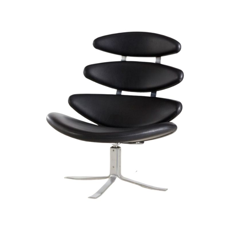
The Swan chair pivots elegantly on the delicate steel base, with just the right amount of sophistication and strength...your version looks like a sand spider waiting to snag an errant rodent.
(all, of course, meant with the gentlest of humor)
And the "sand spider" is...
And the "sand spider" is exactly why I prefer this base. I see no need for an office style contrast to this chair. Thank god Eames did not put the lcw on an office base. It is funny, you saw the same exact quality in my swan that I do, yet I see design harmony from top to bottom and you see a need for contrast. Interesting. I think this explains why I am so impressed with the bulk of Poul Kjaerholm's works. He seemed very careful to design bases that were integral to their chairs, and even the pk9 was a more considered solution than the chair on a stick look. Thanks for your take.
Agreed.
It's like, are we ALL over that, now ? If noting else could have killed it, our endless Barcelona threads would have done so, I guess. . .!
I suppose some would say the same of the other classics, but I don't think I'll ever get tired of the Eames all-wood chairs, at least. . .
I'm sorry to hear that Aalto's birch isn't elegant enough for some. My taste requires the warmth of wood as an ingredient in Modern, I guess. The chrome-and-black world has a cerebral appeal but isn't my idea of a livable home environment.
But that's just me. The Wassily will always look good to my mind's eye, for sure. The Barc ? Tired.
This is fun! I am made to...
This is fun! I am made to question why I do or do not like an object. If I follow lucifersum's contrasting arguement, I would probably not care for the lcw or Saarinen's pedestal group. But their overall harmony is one of their strengths. I am also not so inclined to take WHC's view of the minimal, floating theory. Having lived with an egg and ottoman for the past 5 years, I don't see that. Instead I see a very solid looking metal base and feet that far from being insubstantial, draw my attention because they clash so much in color, material, and form. The sand spider in my living room actually comes much closer to WHC's ideal for me due to a blending of color and form. I think of it this way; This swan basically looks like a crab. When I see a crab it's legs are an expected thing. If I ripped off its legs and stuck it on a shiny pole, that pole would be jarring. You may not want a crab in your house, but the harmony is vastly superior in the wood leg version. I also wonder how much favor for the office type base is due to it being what we are used to seeing, and therefore it is comfortable to our eyes. Thanks for making me really think this out again folks.
I actually prefer the metal b...
I actually prefer the metal base (How is the leg lamination going by the way?). I think of them on these chairs and much Eames pieces as frames or plinths for whats really going on in the body of the chair.
A Henry Moore on an Moore styled plinth? No way.
I agree. It does act as a pli...
I agree. It does act as a plinth or pedestal. Perhaps this reveals a bias of my art training. A contemporary view of three dimensional art that I strive to keep in mind with my work is that the pedestal is a trope that serves to isolate a work from it's environment. It also serves to make a work say,"look at me! I am art with a capitol A". I do not want my furniture to do that for the most part. I want it to be great design merely by being so, Not by proclaiming it's greatness. There are cases where this plinth effect is less avoidable (Eames shells for example) but where it is, I would rather see another solution.
barry
I totally agree with you about the Gehry cardboard things! Plus? I picture getting up from one and having to brush a zillion bits of cardboard lint off my all-black outfit. Blech.
(maybe they have some sort of sealer on them to prevent this from happening, but the threat does come to mind and adds to their uninviting looks. I like chairs that look sittable, whether they are or not.)
If you need any help, please contact us at – info@designaddict.com


