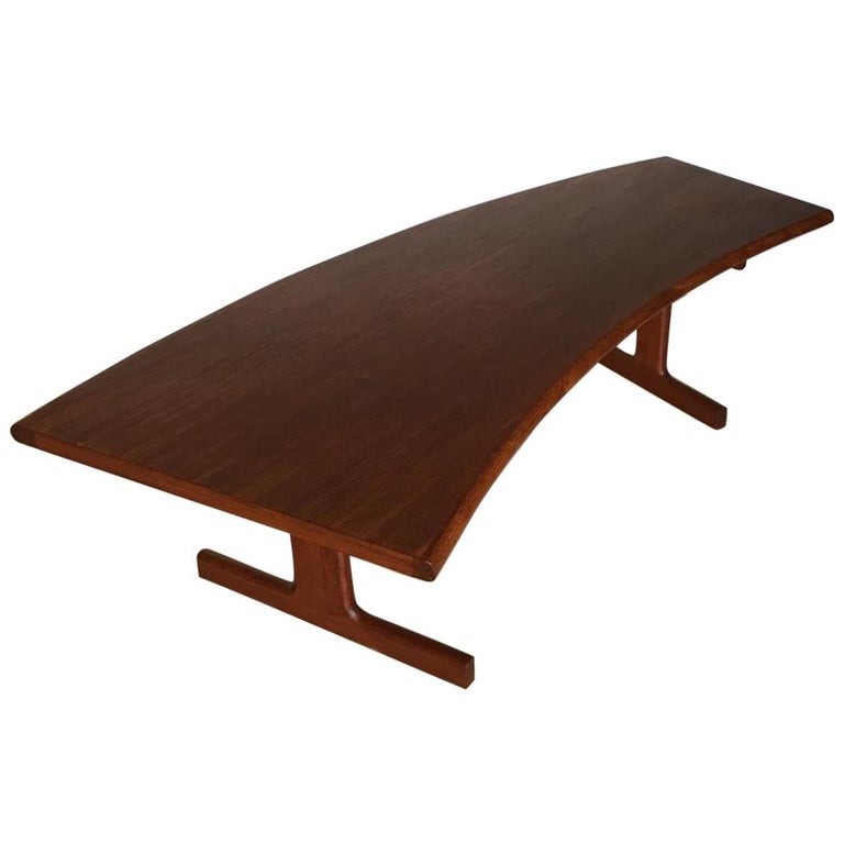
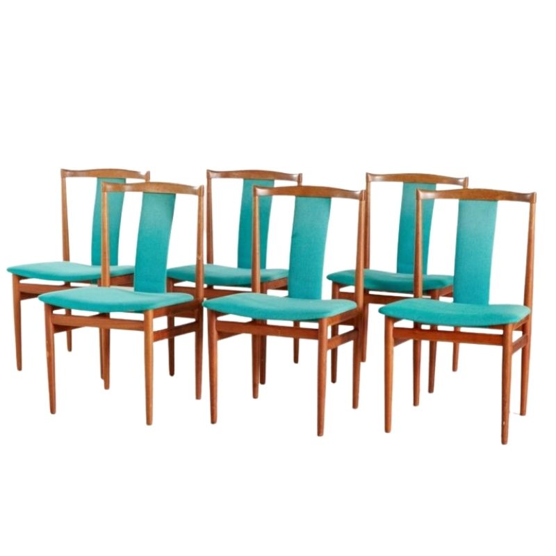
Great basic pieces for lounging
Hey, I love your living room ! All pieces (sofa + Cado RSS shelves + rug + lamp/ bird) are absolutely great choices, fit the space, and are working very well together as well.
I guess your question re: paint & rug stems from the fact, that although everything sofar looks great, there is a bit of an "empty feel" to it. Is that it ? What you want to change ?
Well, if that is what you want to change, I think you'll preferably will want to work in the following order to make your life easier:
1) Pick Lay-out of RSS content
2) Decide on style/ basic needs for room
3) Choose a focal element
4) Find matching accessories to finish the room/ harmonize colors.
5) Send pic to DA for virtual house warming cheers after project is completed ? ;o)
(completely optional, naturally, but everyone here would love it)
Honestly, the first thing...
Honestly, the first thing you want to do is decide how you will fill your shelves. Seriously, it has a large impact on how the room feels. As these are mainly open shelves, everything on it is constantly on display, and therefore is constantly a part of the architecture of your room. If it's messy/ chaotic it will ruin visual serenity & detract attention from your main pieces. The CADO shelves are very architectural, and look their best when treated (and filled) as such. What I mean is: create dense visual "blocks" or "rectangles" that stand out + leave open space that delineates these rectangles. Practically, that often means filling shelves with books ( the "dense blocks") AND leaving some shelves (fully/ partly) unfilled to create a "visual gap". Think of it as drawing a pleasing constellation of abstract forms on paper. (Here, the wall is your paper, and the abstract forms you create by grouping objects together.) Often, a "visual gap" is left just above/ below a group of one or more shelves filled very tightly with books.
Alternatively, a "visual gap" is often left between books and a cluster of decorative objects if on the same shelf.
You'll find these ideas reflected in the way bookcases are styled in ads for Italian brands such as Minotti/ MDF Italia.... They quite often feature great examples. Quite often, they leave some shelves (partly) unused to help create a more pleasing whole.
In your case, I already truly love the way you've put objects on the shelves. The globe light makes the bird silhouette stand out, and the darkish vase above the bird reflects the dark shape. On the other side, the grouping of small white/ dark shapes looks good together, and ensures you've got something decorative on either side.
Also, I think that you made a smart choice by not putting much stuff on your boxes. I'd keep it as it is now: it looks great as it is, and it seems very handy to be able to put down a book, or a cup of tea, or pc on the ledge of those boxes when you are sitting in the sofa.
I wouldn't change any of it, I would simply fill the three shelves on either side tightly with books. (just leave some space on your shelf between the objects that are there and the books.) If you don't have enough books to fill the six shelves, just fill the two lowest shelves on either side, and leave the top one empty for the time being. If you notice that there is a lot of empty space between your books and the shelf above, move your shelves a bit closer together (but keep Left/ Right halves symmetrical). Your RSS system will look best when it looks quite blocky: eg pronounced empty space between ceiling and top shelf - dense block of shelves - pronounced empty space between lowest shelf and box - empty space beneath box. An architectural lay-out is the best way to honour the architectural qualities of your CADO system !
Please, please, please,...
Please, please, please, resist the urge to fill the complete RSS up with a whole slew of mismatched nick- nacky objects crap, and the shelves fixed too far apart. It will not show off your smart RSS, and it will result in a very unrestful living room.
Sorry for the long text, your style seems absolutely gorgeous so far. I guess I am a bit emotional after just seeing some horrible pictures of abused CSS shelves on flickr. Why do some people do that to wonderful furniture ? I don't get it. I saw one photo in particular where the CSS in the living room looked like the shelves of an unkempt pawn/ souvenir shop on the mexican border where items have randomly been put on/ off for the last three decades. Living in that room must give anyone a headache. Why do people choose to do this to such a lovely design system ? *still shaking head*
Anyway, after the css shelves have been filled, you'll see that the current "empty feel" is already much less. Also, with both shelves filled you'll have two columns, flanking an empty niche in between (the space above the sofa, between the shelves). Yup, paining the wall would work to make it look less "empty" in the middle as well, but so would filling the empty space behind the couch with some colored art. Honestly, you do not want to paint first, and then have to buy the rug/ art later. Paintcolors are easiest to adapt to the rug & art, not vice versa.
So, before you turn to the rug/ art, first some basic questions: what sort of style do you want for your room ? a) Loungey, very serene & dreamlike ?
b) Upbeat, a mix of contempory & vintage pieces ?
c) Very trad MCM- period style ?
(seems quite popular in the States right now, a little less in Europe)
d) ...
Your style preferences are really determining for what rug/ art/ colors will work for you. (i'll add some photo examples to explain lower in text)
Also, are there specific items you want in that room ? Or activities that need doing. For instance, if you plan to read in that sofa, the current lighting might not be sufficient, and you'll need to plan an additional reading lamp close by.
Okay, then I'll get to point...
Okay, then I'll get to point three: pick a focal piece.. This is the fun stuff ! According to your personal style preference, pick what the focal elements will be. This is something large/ colorful/ complexly patterned that will draw the eye into the room.
If you'd go for b), for instance you could opt for an eyecatching colorful large painting to fill the niche behind the sofa, and as in the picture, add cushions and/or a wool throw with colors that either repeat or are different variations of the colors already used in the artwork (here for instance: orange/ wine red + blue). You could then forgo painting the wall althogether. (Personally, I do prefer the CSS against a white backdrop, bc it most accentuates the architectural nature of the system and sets of the wood). You could keep the rug you've got, but pull it up more to the sofa (have the sofa's front legs standing on the rug for a cosy feel).
(picture credit: Hay dk)
If you'd like a) something...
If you'd like a) something very loungey, you could for instance pick up a couple of very serene drawings (typical model drawings) such as the ones below, frame them with a generous nice crisp white border. The dark one with a dark wood frame, the light one with a light birch frame. The wall could then be painted a color similar (a shade darker/ lighter) to the background color of the lightest drawing, with a good low VOC chalky paint (e.g. Farrow & Ball, Flamant). The trick would be not to have the paint clash with the wood tone of the CSS. So you'll have to use some testers and be very wary of the undertones (green vs brown/ pink vs yellow) in the paint. Mix something yourself if you can't find what you are looking for. Then add a violet wool throw + a sheepskin for winter + keep rug (or go for a monochrome shag rug instead).

http://www.thedaythat.co.uk/images/tell_me_more/sizes_frame_4a.jpg
Alternatively, you could no...
Alternatively, you could not make ART the center of attention, but TEXTILE. Okay, in that case, start hunting for a very colorful Wall hanging, rug, throw, pouffes. For instance, I am a fan of those welsh woven fabrics. For instance, that kaki pouffe + a nice comfy throw in that beige would be very gratifying. Then pick plain colored cushions (if you like) + paint color for wall/ or simple (DIY) artwork that echo the colors of the textiles.
(credit: Nos Da products by Donna Wilson for SCP)
ite (BE) You're hired!
Ok, thank you for all your advice-very much appreciated and well thought-out.I will definitely avoid the mexican border pawn shop look. lol. I'm a bit of a hoarder and collector
and have a tendency to go overboard. Our style has been a mix of trad MCM with industrial metal and wood factory-type pieces. The couch with the chaise is actually replacing a Nelson daybed- so we're looking to update the look. We're looking to actually get a shag and found a neutral sand/ivory. When you said monochro, we're you thinking a different shade of grey for rug?
Everything about art and paint makes total sense. I like the look of large canvas to fill the space and to inject some color as a strong focal point. (Pic attached). I also like the idea of a grid of pictures or a floating shelf with pictures stacked- but I'm starting to think that might be too much and compete with the shelving unit.
see pic of grid of Charley Harper prints and shelf with prints)
Looks like the single canvas might be the way to go?
Next up - the other half of the room. HA
thanks again!
If you need any help, please contact us at – info@designaddict.com


