Lets start all over again
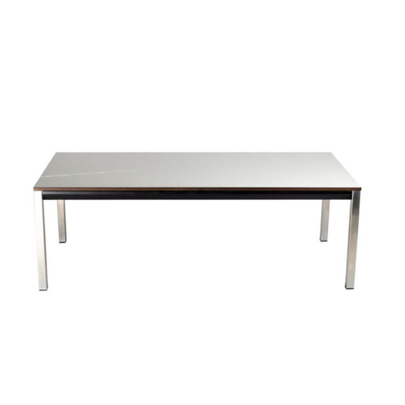
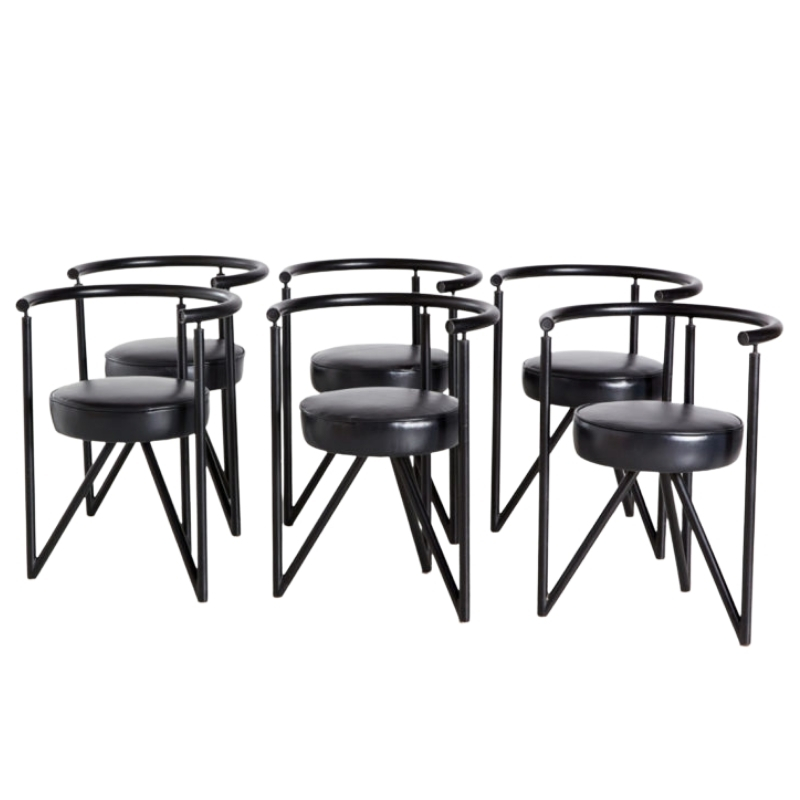
I want to furnish the place with furniture in anthracite pieces (dark grey)all minimal pieces.
Then i like the idea of a grey beige on the walls (not too light so it wont contrast the furniture/i hate black&white interiors)
All the above will make a dead room.
How can i turn it alive without the use of obvious colour?
The colours i like best are petrol blue and orange.
If i put a single , huge piece of furniture , like a see through divider in glossy orange would help? or it would be a sisaster.
So:
Greek marble floor, gray woodwork, anthracite furniture, a whitened oak ceiling (partial).
How about one Petrol Blue (whatever that is) wall, and everything else white ?
Competing with the floor is a losing game; let that be the dominant pattern, and enjoy it. I can't imagine beige-y walls adding clarity to the ensemble. . .
A well-known food critic once wrote, "Hot soup should be hot. Cold soup should be cold. Luke-warm soup is bleaagh."
All
Yeah ok , all white......
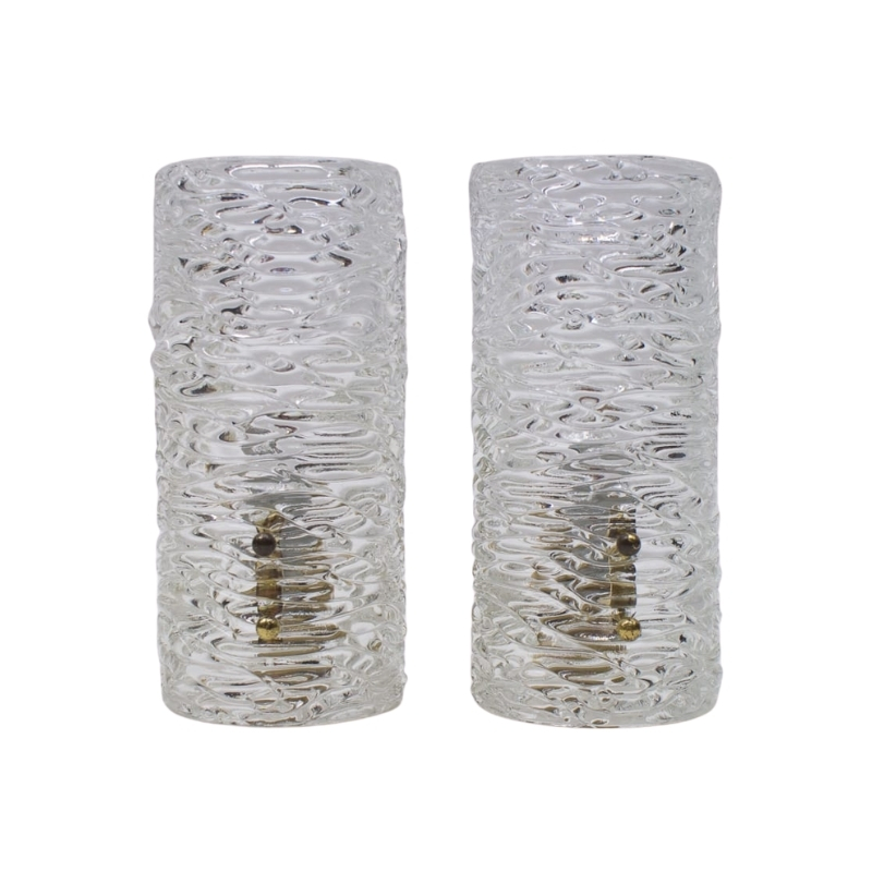
I still like to put anthracite mat furniture , which is a neutral after all.Shall the walls be light or just a few tones lighter than the floor and an even lighter ceiling.Then add drama with orange (or other colour)pieces or ambiance with clever lighting fixtures.
The kind of furniture i like will look poor in a white room , and i cannot put minimalistic furniture in a pastel , multi coloured/tone room.
well...hmmmmmm.....
I agree that doing grey/white/anthracite will be like living in a sepulchre. I also agree that the floor is dominant and any attempt to refute this will fail(just like the 'stupid yellow' has). SDR, with due respect, I don't think that a warmer wall tone be it 'greige' or another subtle color will look bad. I think it will provide some needed balance to a very cold room. Some1, you keep bringing up orange, I think that a true orange will be painful, but I could imagine a soft pinky orange (not peach, mind you, something more greyed)used on the walls and even wrapped up onto the ceiling. Whatever you pick has to be a subtle contrast to the marble and be of the same tonal depth, high contrast is going to give you a big headache. SDR, petrol blue is a light slate blue/grey color and I can imagine this being used to advantage with the grey marble, but it will keep the room very cold looking. Some1, I think that you should think of this space as modern in your utilization of it and what you put in it, but accept a certain deviation from 'modernist' colors if you want to create balance with the floor. Otherwise, go with SDR's suggestion and do a white-out space and bring all the color in with furnishings. For me that would be too high concept/museum-ish to be truly comfortable, but maybe it will work for you.
no museum
Exactly , i dont want to make a museum , nor a pretentious fridge.
Looking at it more and more and trying swatches... the best match is a more or less grey wall.This neutralises the floor, and leaves a clean canvas.I can chose i grey for the wall that is a bit warmer than the floor but exactly the same tone.White paint for the ceiling as to neutralise The stained white oak part of the ceiling.
All the above will help the floor to calm down.
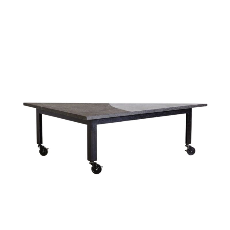
Sofa , tables etc will be anthracite.All very minimal pieces.so they will look like shadows (their dark tone will help get all attention off the floor)
So now i fixed the tonaliity and newtraliase floor and ceilings..
Then what ?
whatever coloured item except blues will scream (i am an orange/red/pink lamp , chair , etc...)
help again
OK, one more time...
I think your decision to use a neutral envelope for the room is a good one. It's a popular choice in many modernist designs and with your floor being what it is, it's probably the most calming choice. I still think you should reconsider putting stark white on the ceiling. I very much doubt that the stained oak ceiling is truly white, and I rather think that you'll end up with a 'sandwich' of the floor and the ceiling in the rest of the space. I'd consider wrapping the wall color onto the ceiling or perhaps finding a tone from the oak that you can utilize to tie it together better.
You have mentioned orange and blue quite a bit. On the color wheel these are directly opposite each other. ie: complimentary colors. These will give the room a very bold feel. You want subtle color, so I wouldn't do a straight complimentary scheme. Instead I'd do analogous colors with a complimentary accent, which is called a "split compliment". A color scheme with analogous hues gives a calmer feel than a scheme with opposing colors, logical, ya? The split-C scheme allows the use of 3 main hues, 2 of which are analogous to each other and one that is the compliment. I use a split-C with a dulled citron green, a deep rusty red and a greyed fuscia. The direct compliment to a yellow-green is a red-violet. The two colors adjacent on the wheel to red-violet are true red and blue-violet. That's how you select the colors in a split-C scheme. Personally, I don't care for blue so I nudged the purple tone back towards the red for a fuscia and I didn't want to use a true red so I moved one more step on the wheel for the red-orange. The split-C scheme can be somewhat forgiving. I have use all of these colors in a flattened (which means that the colors have been muted with their direct compliment and give what designers call an 'off-color') or greyed (which means black has been added, this is properly called a 'shade' in color theory, the opposite is to add white which is called a 'tint').What this all does is decrease the saturation of the hues so that I'm not bombarded with strident color.
OK, so much for Color Theory 101
For your room, using the petrol blue which you love wouldn't be a bad choice. It's going to work with the light coming into the room and it will play nicely with the marble. This blue is a greyed tint of true-blue, so therefore the direct compliment is orange. However, since the petrol blue isn't a fully saturated blue, neither should the orange be. And if you do a split-C, you'll be using a yellow-orange and a red-orange. I rather think that a muted copper (yellow-orange) and a rust or blood orange (red-orange) would work nicely. Another option would be to start with orange, I'd think a salmon tone, then do a soft periwinkle tint and a greyed turquoise. Remember to keep the depth or saturation of color the same for all three colors to keep things soft and balanced. Yoou can affec tthe warmth or the room with these schemes by which color you use more of. Using two blues will keep things cool, two oranges will warm things up.
I'd consider taking SDR's suggestion once you have the colors decided and the furniture layout determined and do an accent wall of some type. You don't have to paint even a whole wall, you could just do a color-block behind a piece of art or frame the sofa or whatever. My reason for thinking this is to balance out the part of the room with the different ceiling.
Last time I think my link to a color wheel, crashed the post, so just google 'color wheel' if you want to see one.
If you need any help, please contact us at – info@designaddict.com


