Dearest Auntie,
This is such a timely post! You see, I am buying a teeny little condo with a long, very narrow living room (21x11); it has about 7' of sliding glass doors at one end with a view to lovely green trees. The place is a dump at the moment and I got it for cheap so I have some money to make it the way I want it, thank goodness.
Anyway, I have been seriously contemplating mirroring the long solid wall in the living room which will reflect the view out the big glass doors from many points in the room, plus will reflect the entire room. I'll be getting a 22x21 living room, but just won't be able to go into one half of it.
Some of my friends and family with great taste are urging me to go for it. One of my kids thinks it's tacky. But I dunno...the room is pretty cramped as is and also darkish (NE exposure with shade trees) and I think I'll feel like a hobbit in there without the mirrors.
I would be getting non-beveled mirrors. I have photos of another unit in the same complex where they did this and I adore the look of the room.
So, I remain--
yours in mirrored solidarity should you choose to re-mirror,
Spanky
PS OMG NO DO NOT REMOVE THEM YOURSELF!!! YOU'LL BE A BLODDY MESS!!! (seriously, you'd probably have to break them and tiny shards of glass go flying everywhere, even when you put tape all over the thing first, and sheet plastic, and OMG IT IS HORRIBLE. Guess how i know.)
spanky
Considering what you have said, and considering the dimensions and lighting situation of your new place, I think one mirrored long wall is quite appropriate.
The only thing that you might want to consider is making sure you leave at least a small amount of that long wall that is not mirrored. Just my opinion of course!
You might also "veil" it a bit... with a plant or two, or something to help "confuse" the transition from real to reflection (in a good way I mean)
I do agree that the sense or illusion of more space would make a huge difference in how your place feels. The difference between 11 and 21 is huge.
Plus, you already have seen an example that you love!
Mark, I would by no means...
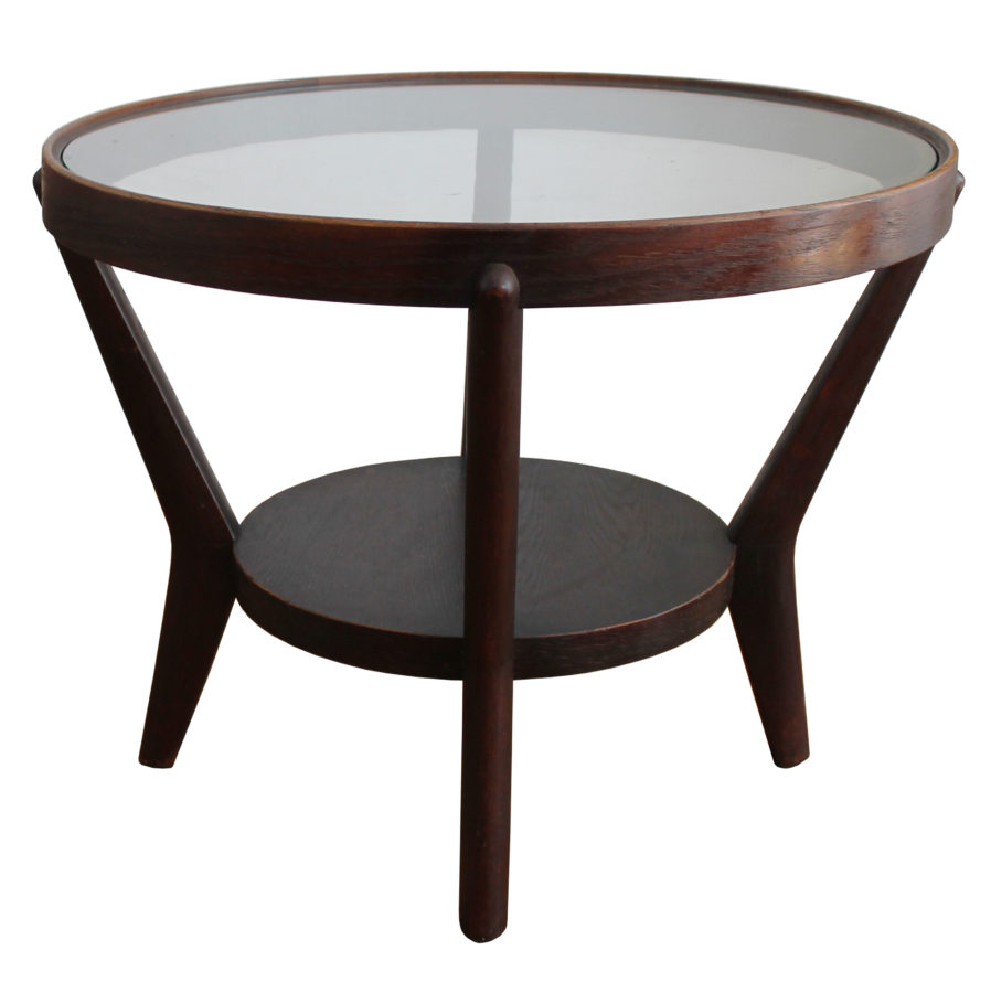
Mark, I would by no means consider keeping the mirrors. Instead, turning the room into a modernist masterpiece (if inspired by your coffee table) would, I think, be the best use! When it comes to sofas, one can not go wrong with a Corbusier LC3 or LC2. With a little patience, a great example can likely be found much less expensively than their absurd price new, as I'm sure you know very well. With the wall now white and pure, there is time to focus on its surroundings. You have lovely wood floors, which would contrast nicely with a soft white rug (something like a flokati perhaps). A grouping of furniture may be nice. A lounge, armchair, and sofa? Another option is that you could forget about a sofa completely and replace it with something that will comfortably sit two people individually. To sum it up, I think that room is begging to be refurnished with a gentle dose of iconic pieces. Mies, Breuer, Kjaerholm, Corbusier, and maybe a bit of Platner or Jacobsen could be nice. Mark, we know you have great taste. For the purpose of health, keep the treadmill. The sofa needs to go, however, as does the mirrored wall. What would your preference be if you were to refurnish?
P.S. I would not at all be opposed to some Eames, Saarinen, Florence Knoll, or Nelson pieces, but the room needs some attention.
Would you be so kind as to take a few extra photos of the space and maybe we can all contribute our thoughts to help you?
I think the main problem is...
I think the main problem is the rest of the room and the orientation of your furniture.
There should not be furniture up against the mirror unless it's smallish.The lounge should be side on and off the wall.
Rather than waste money on something that can be made to work I would invest in a better sofa,rug,coffee table first.
With sofa side on put a Kentia Palm between it and the mirror which will double the foliage.If too wide then a Ficus Lyrata which are fabulous.Plants or bunch flowers really uplift the room so I recommend it.
If the mirror had to go I would not hang another as that is worse.That is unless it's something amazing like Fontana Arte type of course.An extra large stunning abstract with some colour I say.
What about replacing with same size mirrors with antique effect which is all the rage.
Or if cost is no issue remove the wall completely and install a freestanding open bookshelf but this would be costly in demo and repairing the floor to match.
Also don't forget you can always hang a huge abstract on the mirror.No drilling just some double sided tape and silicon for extra hold to the hooks.Next day hang it up and if ever you change your mind just slide a sharp blade behind and no marks or scratches left behind.
All comes down to style and imagination I guess.
Good Luck.
I don't want
to make a judgement on the mirror until I know the shape of the room. But I have no immediate impulse to advise its removal. Remember that the room may feel much smaller when you take the mirror away -- are you prepared for that ? (I guess the Foamcore trial will demonstrate that.)
If there had to be a mirror, you did it nicely: Floor to ceiling and neatly to the edge of the partition wall. Are those bevels at the joints ? No bevels would be better, in my opinion.
Mirror is tricky (among other things, the wall must be perfectly plumb and flat, with no twist !). For those who despise the idea on principle, a suitable alternative to full wall is do do the part of the wall that's away from the entering point -- near a window wall is a good place for it. This way you get the impression that there's "more room" around the corner -- and by the time you're into the space it no longer matters that this was an illusion.
The danger is that the absence of mirror on any part of a wall leaves the impression that there's a column, a beam, or a step to get past into the phantom space -- much less an entire wainscot-height barrier. This has to be managed carefully. It can work, or it can be ridiculous.
One of the most effective mirror installations I have seen is where small pieces of mirror have been applied to recesses at corners of a room; you never catch your own reflection in them, and they silently suggest -- without even being noticed as such -- that there is more space, or or an extension of a wall.
Well
Nothing wrong with using mirrors in a commercial space to enhance the illusion of space and to release a sense of claustrophobia, but in domestic enviroments I always have the association with - excusez le mot- cheap porn.
A great painting or the right colorbalance can do so much more for a space than a wmirrored wall. However: a large mirror placed on a beautifully painted wall does add class .
Also, the positioning of furniture, its materials and a good use of sizes i.e. High and low pieces can create the right depth to make a space feel comfortable and less cramped.
Are mirrored walls a tragedy?
Yes... if they are antique effect as starline mentioned. Good lord, is that a thing again?
I agree Hazelnut's suggestion to do a tester with foam core or similar is well worth the effort. Having that wall of mirror covered over will make a startling impact on the look and feel of the space, and you may want to get used to a blank wall for awhile until you can decide if you want the mirror back or not.
I love your choice to remove the crown molding Mark. I have done it in a previous home and was tremendously pleased by the result....
(edited spelling not content)
I want to thank every one of you for your advice.
I so appreciate it. I am off to get my hair cut, and will photograph the entire room upon my return. I am so lucky to have all of you seasoned designers as my friends. This forum is such a bright spot in my world.
Cheerio, etc,
Aunt Mark
"In or out" is irrelevant...
"In or out" is irrelevant indeed, more important is the fact: do you have stylistic assurance at your disposal or not.
By the pictured example of Mark's living room you can assume that he's quite lacking in stylistic assurance.
Mirrored wall, fake mouldings all over, shaded wall lamps, laminate flooring mixed with some MCM classics, a typical example.
Very often those people prefer to install an Eames lounge chair with footstool in the middle of the room to show to everybody: et voilà, I'm a design expert.
Then the tragedy is perfect.
pubpat
Certainly, not all of us have the luxury of living in beacons of modernist architecture and design (whether contemporary modern or a well-preserved original example). Perhaps there are restrictions in Mark's building. Or perhaps extensive renovation of this space is not an immediate goal, since he has just purchased another home. Life is filled with compromises. We make the best of what we have.
If you need any help, please contact us at – info@designaddict.com


