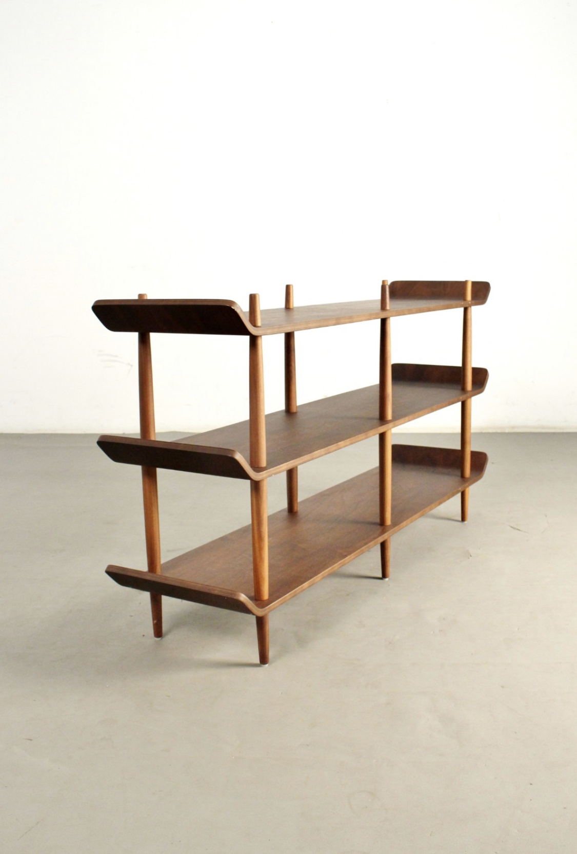
@wesemael. If you look at the Willem Lutjens design ,
1 :- the ends of the shelves are more upright than the ones on the OP's.
2:-Also the uprights/supports are less tapered than on the OP's
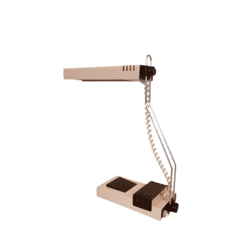
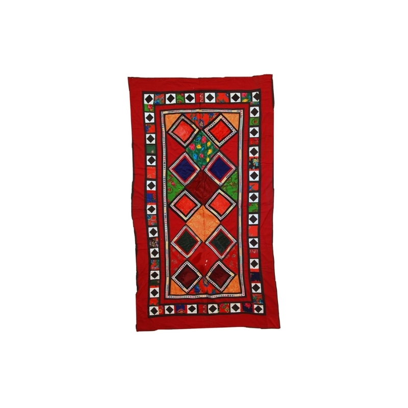
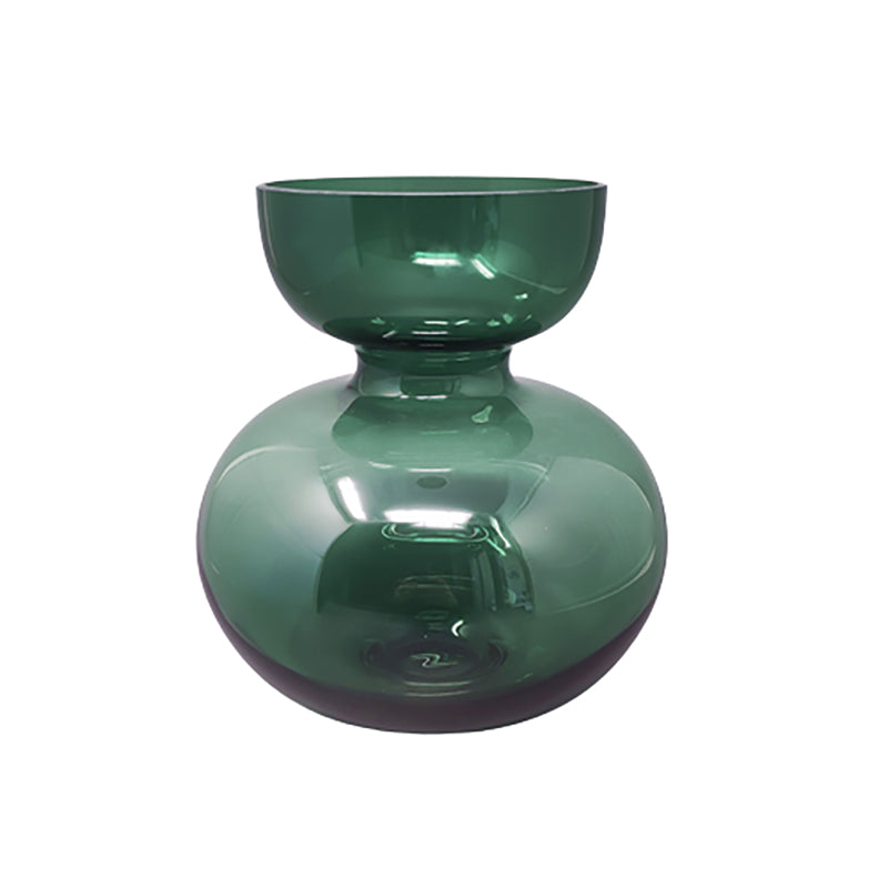
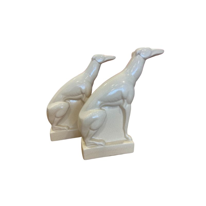
I have found similar shelves ,as the images above, made by Sean Dix. An American born designer, now based in Hong Kong. Certainly inspired by Lutjens .
Knowledge shared is Knowledge gained
If you need any help, please contact us at – info@designaddict.com


