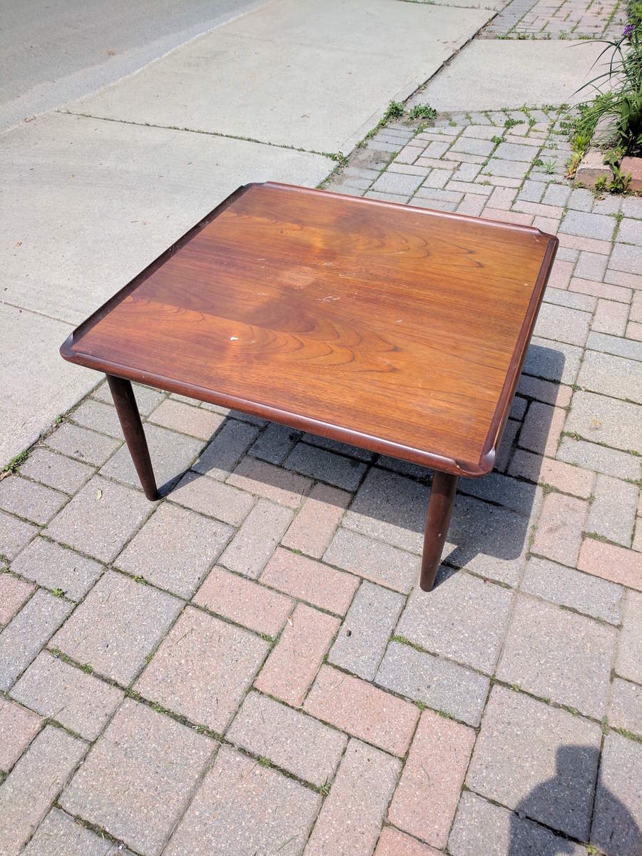
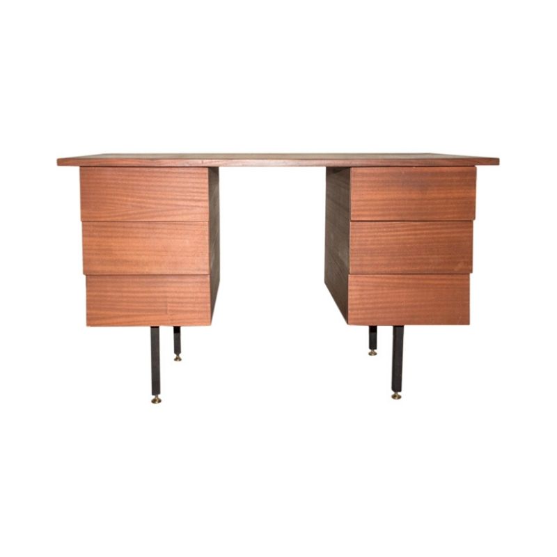
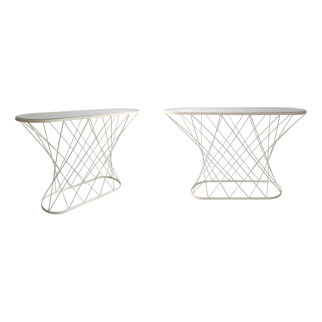
Interesting. It looks a bit like a table that Selig imported at one point. More photos?
Any indication, like a made in Denmark or something as to which way is up?
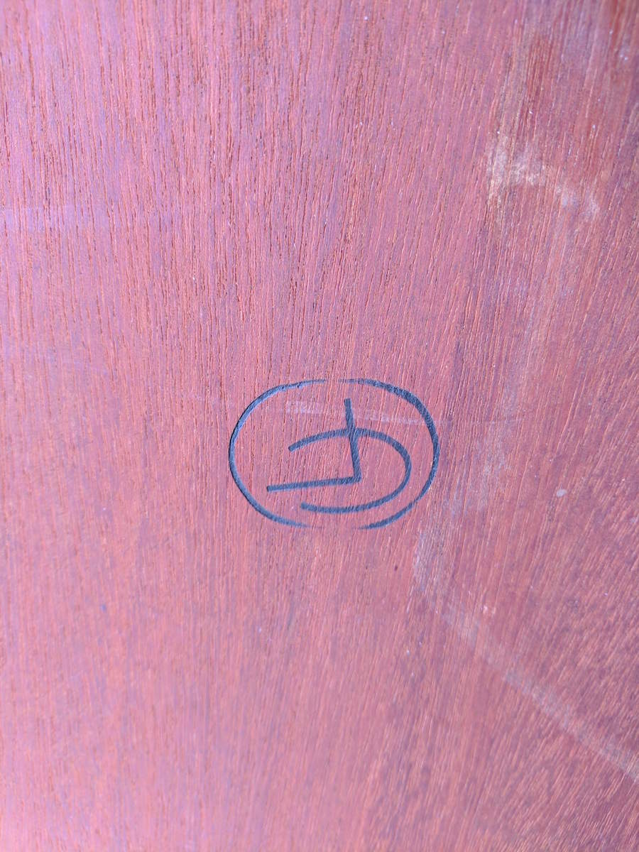
It looks like there are the letters C and F, but I am not sure which order to put them in and I am not sure if there or more letters or if it is only them. These Danish initials logos are very hard to read, even when you are sure of the letters it is very common to get the order wrong. We tend to read top left to bottom right, but many of them were meant to be read in order of descending or ascending size. Or there is no way to know which order the initials go unless you know the name for which they stand.
For instance there is a logo for Hundevad and Co that looks like CHO, but is actually HCo. And there is one for V. Schou Andersen that looks like SVA, but is actually VSA. And another for HNJ M
Leif thanks for the input. I'll upload more pics later. Interestingly enough I spoke to the seller and he said the furniture was bought in the 1950's by his parents. I bought it with an unmarked PK61 coffee table that I'm hoping is authentic, so I have been working on confirming that.
That does seem like an odd name to put on a piece, but it is often far more likely to know the maker's name and not the designer's. That is always a red flag. And this is for the simple reason that many pieces have a maker's mark right on them. To know the designer only, you have to find a piece that is unmarked, or with an unknown maker's mark, then happen to find the same design in one of the few retailer catalogs that mentioned designers, but not makers.
Obviously this happens, but only rarely.
The other problem is that almost any designer name is better than none for value purposes, and often I've noticed seller's avoid mentioning the maker, especially when it is the only thing they know, because it gives the impression that a piece is generic (often the right impression).
So, while the fact that a seller called it a William Watting design may have its uses, I wouldn't put much faith in that at all as truth until you have more evidence.
Del: I did not see your first response up there. We must have started typing at the same time and you finished first.
This logo becomes more and more interesting. I thought the outer ring was a circle, or maybe it was broken at the top and bottom (so that it could perhaps be a C, but it seems I was wrong on both account.
It seems to be an oval roughly (reminds me of a potato frankly), and the line seems intentionally thinner top and bottom. How odd.
Yes, indeed it does. In a certain sense it makes it that much more Danish, in the sense of danish design belonging to all Danes. This is why the differences between so many Danish designs are much less dramatic than between say American designers. But in this case the maker & designer may have been sailing too close to the wind.
If you need any help, please contact us at – info@designaddict.com


