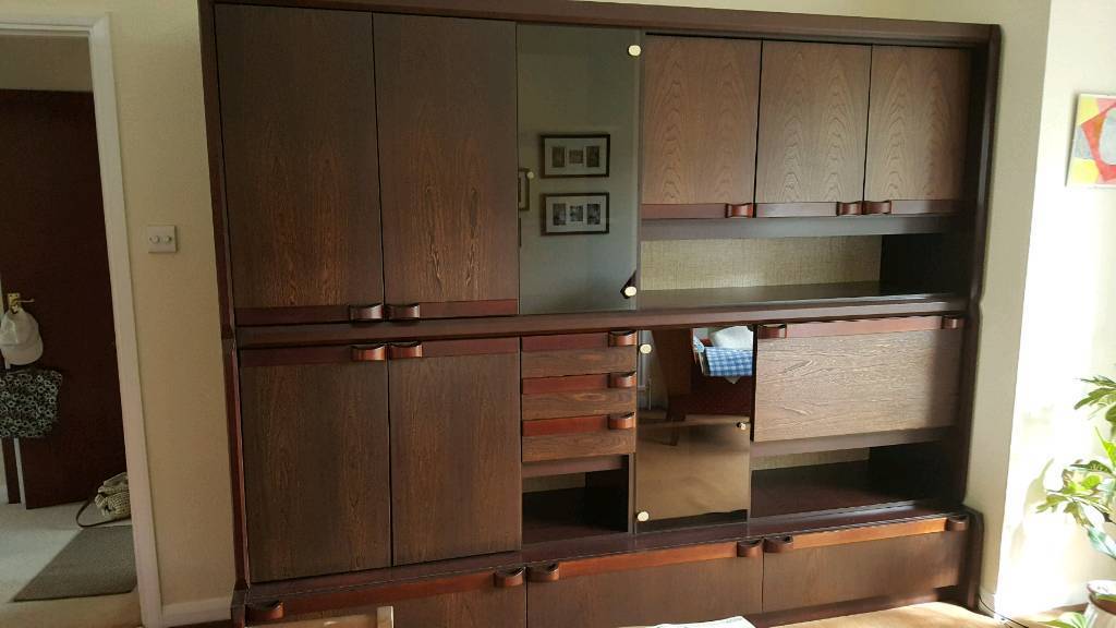
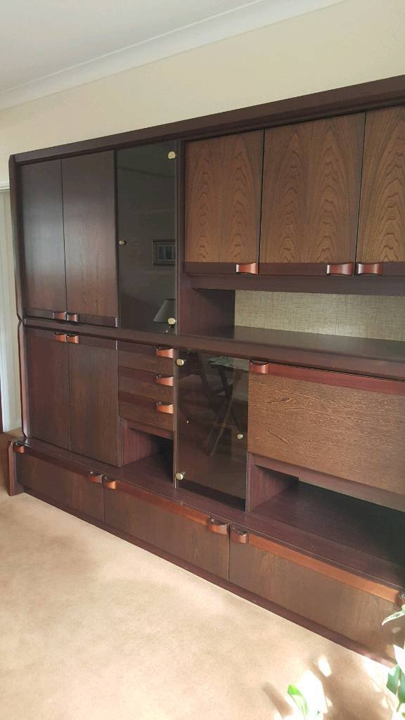
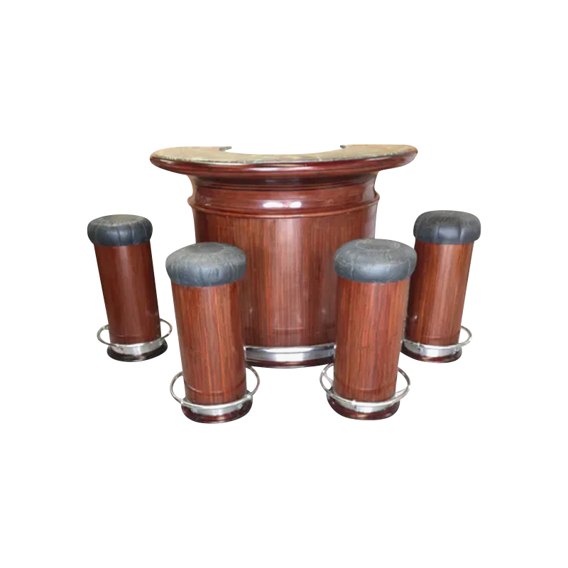
Man, I think 70's is pushing it ..... looks more 1980's to me. When did they start using those through glass hinge attachments?
In either case, it is highly unlikely that it is rosewood. Anything is possible, but with how late it is, it would have had to be made from some rosewood veneer stocks sitting in a wood pile somewhere.
Also with how late it is, it could certainly be Danish, but by the late 1970- early 80's, it doesn't really matter if it was Danish, if it was not also by a famous designer and maker, and there were not a whole lot of either of these at this point.
For me, even if it were France and Son by Poul Cadovius, I would still have to think long and hard about it, due to it's heavy, ugliness. I would not want it in my house, and I am not a fan of flipping things that I wouldn't want in my own house. Plus it looks like a real pain in the ass to move.......
just my two cents.
I don't think I disagree on any objective front... Just that I weirdly like it? I think it's dark stained teak, I feel like you can see the heavier grain in the light.
The things holding me back are the fact that I have no space, especially for a hulking piece like this, even if it does split down horizontally. And then the two detailing elements I dislike: one is the veneer colour not matching the and the handles and then the through glass hinges which is also a turn off for me. That made it 70s to me.
But I'd be lying if I said it weren't mainly the space thing.
I wouldn't be buying this to flip, it's hard enough flipping mid-century stuff this size! Let alone stuff only I would find visually appealing.
If you need any help, please contact us at – info@designaddict.com


