Hello all,
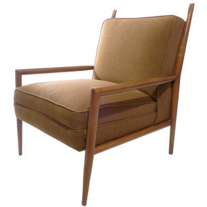
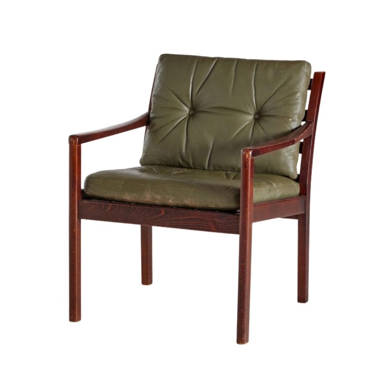
I recently acquired this chair and would like to pin down possible designers. It resembles certain Robsjohn-Gibbings/ Widdicomb designs, but with obvious differences. The cushions are affixed to the frame. It's been reupholstered (terribly!) so there are no tags present.
I really enjoy the lines and esthetics of this chair. I will definitely be reupholstering and would love recommendations for proper upholstery as well.
Any information is appreciated!
Thanks,
Josh
 <img class="wpforo-default-image-attachment w
There are many good fabrics out there that will look good for this chair but you need to consider where it is going. You may have selected the best looking and most expensive fabric but if it looks wrong in the space, it is never going to look right. Always consider the context on where it will be placed when selecting upholstery materials.
Fully upholstered pieces are best kept plain (solid color or textured), simple and neutral.
I don't think it's Robsjohn-Gibbings. His chairs with this style frame (round profile parts, mitered joints on the corners) always had a top rail on the back done in the same was as the arms and seat frame. Also, your chair's seat frame is constructed differently. It has a deeper frame, probably to accomodate coil springs. You can tell by the welt that goes around the middle of the seat. This is done so that when the coils are compressed, the upholstery fabric doesn't bag out on the sides overly much---it will only balloon out above that line of welt because below it the fabric is covering the wood frame only. Does that make sense? It doesn't really matter why it's done, it's just an indicator of the chair not being Robsjohn-Gibbings.
Anyway...what minimoma said about fabrics. If you're keeping it, do it in a fabric that works beautifully in your room and with the maple (?) and the chair will be at its best. If you're going to sell it, pick a neutral that compliments the wood color, so that it appeals to the widest market. (Sorry, that's just how that works!) Use a fabric that is appropriate to that era; no chenilles, no microfiber.
If you are attempting to correlate with other fabrics, keep swatches of them in your car so you have them when you need them. As mentioned above, the context of the thing is pretty much everything. If you have your context with you, you will waste far less time in the process of making your selection.
Yeah to that! Some of the R-G chairs in this style were done in big, bold prints originally. I think "Names" by Girard (or something similar) would be great. Or "Elise" from Unika Vaev---more of a decorator look.
If you go this route, pick an upholsterer who knows how to match patterns at seams. It really cheapens the look when no regard has been given to matching.


If you need any help, please contact us at – info@designaddict.com


