I would guess it is a maker. I believe the name of that hand is Fraktur. And I believe it says H. Koch. Or more precisely, I believe the first bit is just "H" and I am confident the second bit is Koch. Fraktur, Schwabacher and other black letter gothic hands are handwritten forms, so it can be hard to read them without sufficient text to learn to read them, especially the capitals which can be highly decorative.
I would see if you can find other copies of it on the internet so that you can see another example of the makers mark. There might be strokes in the lettering that did not come through clearly in that brand/stamp.
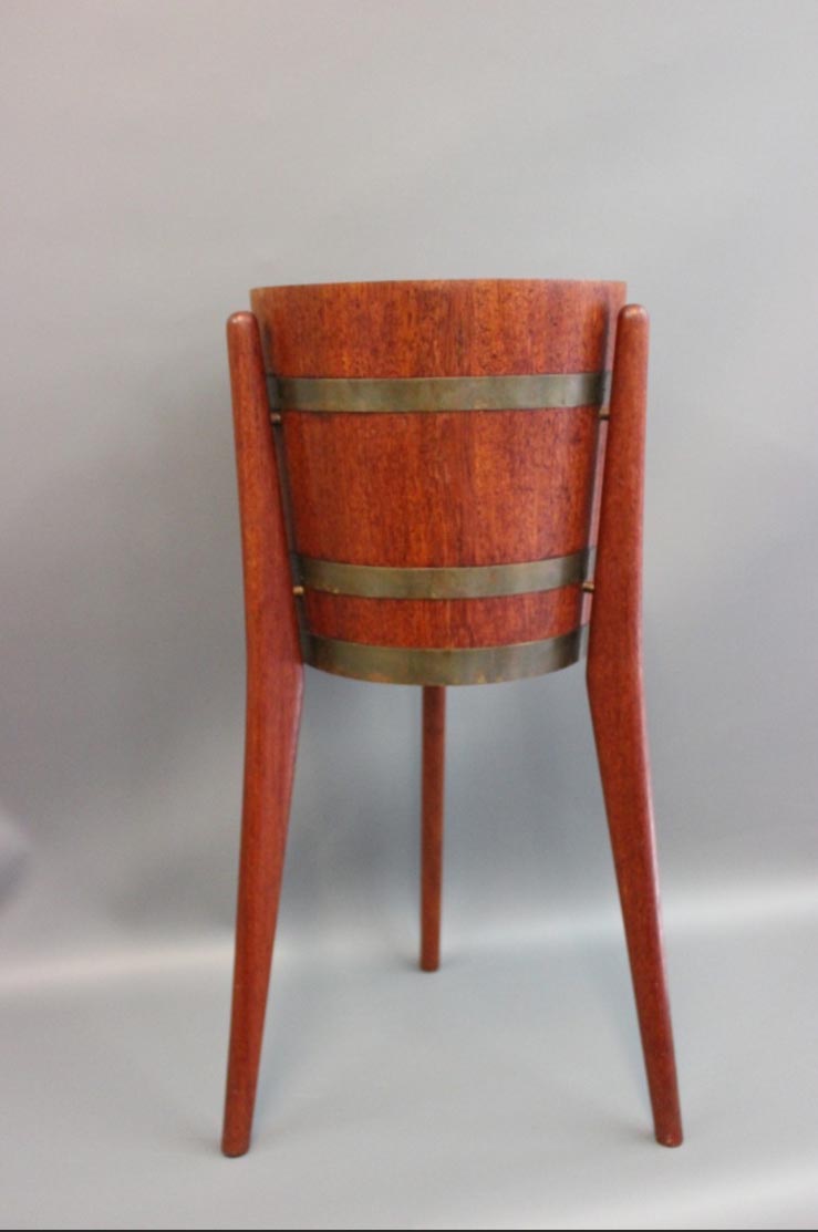
I have a very similar circular teak planter. While mine is unmarked, I found a slightly taller one, but with identical details marked Jydsk Boedker Kunst. I even came across a photo of your racetrack version during my searches. Detail-wise, however, the pieces look like they were made by different manufacturers (e.g. rounded leg edges and top versus sharp), as your stamp would indicate.

If you look at this other Fraktur (Mainzer Fraktur), at the H and K, you will notice the same general shapes as the mark. But in the mark, there is an additional thin vertical line beside the stem of the H and K. This is an identical decorative element added to both H and K. This is a very common sort of thing with the handwritten calligraphy, especially capitals.
Also conveniently, you can derive the same result by reduction: H, K, M, N, R, and Y are the only letters with a "foot" at the bottom of the stem. So the letter needs to be one of them. And it is not a K, nor, M, nor N, nor R, nor Y.
If you need any help, please contact us at – info@designaddict.com


 <img class="wpforo-defaul

