

Search result for: the-last-thing-you-aquired-
| # | Post Title | Result Info | Date | User | Forum |
| Wow ? a lot of talk while I was on vacation. | 1 Relevance | 17 years ago | Friend of Design | General discussion | |
| Wow ? a lot of talk while I was on vacation. First, thank you Ms Johnson for taking the time to respond and confirm, as I suspected Modernica is behind the image stealing issue and retailers such as yourself just perpetuate their values. I am referring to the image of the Wire Chair with the black leather bikini pad. And yes Modernica is the ?official? manufacturer of the ?Case Study Furniture? which is a name they ?borrowed? from the January 1949 Arts and Architecture magazine Case Study House program, in which Charles Eames and Eero Saarinen participated along with several other notable personalities of the time. So in reality Modernica has authorized themselves to sell the non-designer authorized/licensed product designs they manufacture ? And who said bait-and-switch days are over? By the way they had to come up with some name that would give them credibility and a connection to Eames because Herman Miller owns the rights to the Eames name and since ?Case Study? was closely linked with MCM and Eames ? it worked. Also, I noticed how you very cleverly placed Charles Eames? photo above the link to the Case Study product with a note that proclaims Charles Eames to be the designer of the Eames Chair ? or how if you search the name Charles Eames on your site and it takes you right to the Modernica product page ? what a perfectly innocent way to drive uneducated consumers to non-authentic product purchases. But of course if one were to believe everything they read on your site we would never question you are selling anything but the real thing ? your proclamations have such conviction that you are telling the truth and nothing but ? you even guarantee it! If you truly believe Modernica is the authorized manufacturer of these products ? why would you even consider using Charles Eames to sell them ? seems like a search using Jay and Frank Novak should turn up Modernica? I mean clearly everyone gets they are Charles Eames Designs ? so give the guy and his family their due! Further more when a manufacturer such as Vitra or Herman Miller allows resellers to take advantage of their brand along side knock-off products (or knock-off brands such as Modernica) it creates a relationship link in the mind of the consumer ? and allows resellers to do just what you did ? claim the credibility of the real ?brand?. I would not call Vitra anticompetitive for not selling you product that you position along side Modernica?s ? I would say they are protecting their hard earned brand name and reputation! I hope you aren?t planning to take Vitra to court with this notion of violating the Sherman Antitrust Act because they won?t sell to you any longer | |||||
| Wolfe Pt 4 | 1 Relevance | 20 years ago | dcwilson | General discussion | |
| Wolfe Pt 4 Wolfe didn't like a city full of Mies glass boxes. Or perhaps more precisely, he did not like a city full of imitations of Mies boxes. He found inverted massing and exposed skeleton and Corbusian brutalism ugly. So: okay. What form language in history can one point to that did not produce ugly buildings as well as beautiful ones? I've been to Florence. There are some real turkeys there. I've lived in San Francisco and not all the Victorians were quaint. I've been to Wolfe's south and not all ante bellum slave master's plantation houses were beautiful and dignified. But what about Falling Water, Tom? What about Saarinen's buildings? What about Columbus, Indiana? Its a beautiful blending of old and new. Still, despite the simplistic argument he made, Wolfe did a service to modernist design by calling attention to some of its too sterile, to alienating aspects. Modernist design, even the best intended of it, was rather tightly focused on finding a new form language for the 20th Century technologies available for building and manufacturing. As we've said here before, Louis Sullivan's functionalist philosophy, which paid attention to both form language and ornamental language, was essentially eclipsed by a modernist philosophy that sought to simplify even more, for awhile, in order to get the form language right, before moving on to a reintegration of ornamentation and other issues. Well, what the heck is evil about that? Noone forced either Dictators or democrats to build modernist structures. People liked the idea of them, at least, or they wouldn't have commissioned them. But clearly modernism needed to do and be more than it was. But perhaps the best thing Wolfe did for modernist design he did unintentionally. By really hooting and deriding post modernism (which he blamed on modernism, of course), he actually exposed alot of it for the crap that it was and actually laid the groundwork in a way for today's rebirth of neomodernism. I think we all understand here, particularly after some of Koen's more penetrating insights, that neomodernism is not going to cut it for long, because it really lacks, so far anyway, a strong philosophical underpinning that can see it through a rational integration of both the emerging technologies of our time and the emerging and/or persistent problems of our time needing design solutions. Nevertheless, at least we are back at trying to take rational form languages forward again. We are ready for an emerging body of thought to integrate into a coherent philosophy that can animate our use of new technologies and the ways in which we choose to design our way out of the messes that society is currently making. | |||||
| Ib Kofod Larsen- Elizabeth chair- Is she really Elizabeth? | 1 Relevance | 10 years ago | csdalton61 | Identification | |
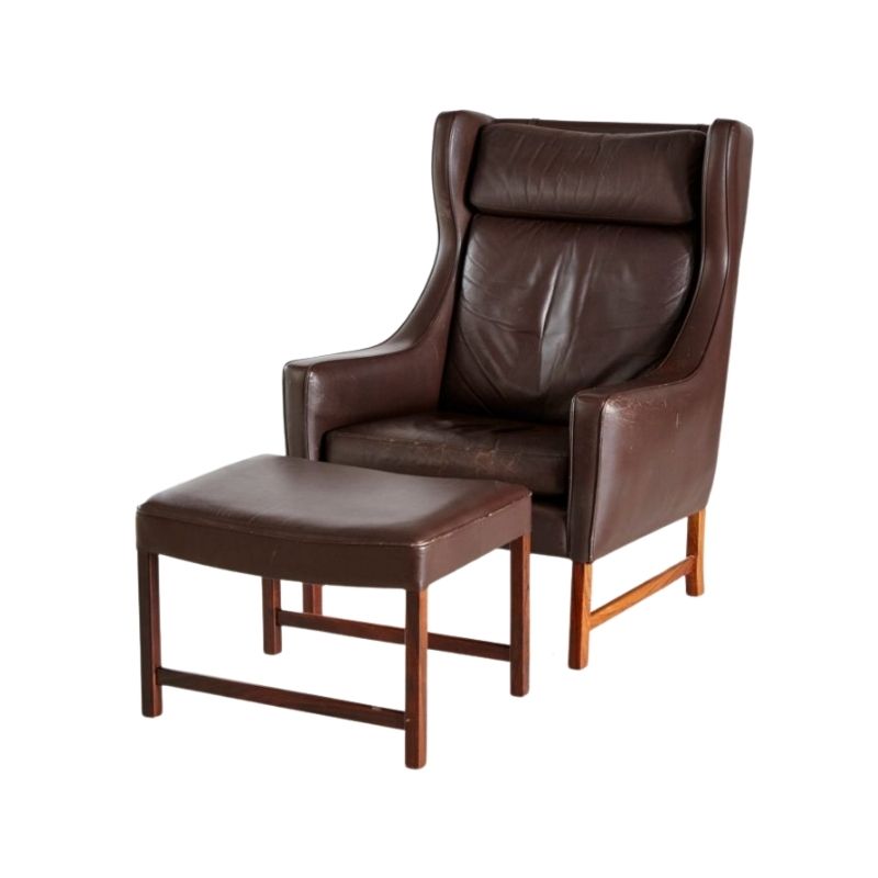
| Hi everyone from sunny Spain Barcelona, I have read several of the threads and there seem to some real experts here, which is just what I need. Here I have the photos of my really lucky find. I believe she (Elizabeth) is the real thing, the one everyone would love to find! Is she? Recently bought on a famous second hand page from a lady who told me they were Swedish, and that her parents bought 2 in 1961 (the year she was born) to decorate their new house. Sadly the other one she threw on the tip the week before I bought it because the arms had become unstuck! You can all gasp and send hands to head at this moment! No makers marks, at least at first sight on the wood. Very badly reupholstered in the 70's, (look how the front looks square due to too much leather on the curve and the lip finish). And no cushion, I just put a spare one on to see how it would look. Quite a few marks of unwanted visitors (woodworm), but quite manageable. ( I immediately started injecting) should I freeze? I have no idea what wood it is. Teak? Rosewood? The frame is sturdy but creaks a bit. So my questions to all are..... How can I tell if it's a Christensen & Larsen, is there any foolproof way? DId they "always stamp"? There is NOT one bolt or screw on the chair! The joins are fixed and carved into the wood, even the bucket shape seat joins and sits on the base with 2 wooden 1cms round pieces that slip perfectly into the seat What was the original filling of the cushion, horsehair, foam? Should I completely restore myself....oooo! Bad idea? Or just reupholster? and in what? Leather? Red or brown? Material? What were the originals upholstered in? As you can see, I am at a loss, I have no idea what to do with it? Apart from sitting down opposite and looking at her with enormous respect, I even stroke those beautiful razor sharp arms. So, what on earth should I do? Is she Really the "Elizabeth Chair"? Many many thanks to all that can give me info and advice here! | |||||
| Caplan, cont. | 1 Relevance | 22 years ago | SDR | General discussion | |
| Caplan, cont. " 'Remember,' Eppinger says, 'that when Rohde came to Herman Miller all the company made was case goods. Rohde introduced seating, which they had no experience manufacturing. Like all wood factories, they resisted everything that wasn't wood. Upholstery and metal were farmed out.' "By 1934, Rohde had gotten the company into the upholstery business. 'We were now making everything but kitchen furniture,' De Pree says, 'but I still don't know how we were paying for it. We were an undercapitalized company.' "Undercapitalized though they were, Herman Miller took extra space in the Keeler Building in Grand Rapids and displayed a full Rohde section and a full Frieda Diamond section, like a company unsure of what it wanted to be when it grew up. The same year, Jimmy Epinger, then the East Coast salesman, occupied a desk in Rohde's studio in order to learn about modern furniture, the first step toward establishing an important Herman Mille principle: design innovation requires innovative merchandising techniques, and these in turn require that salesmen understand the design. In 1934, Wanamaker's had 12 sample rooms of Rohde and Diamond furniture in their New York store and 13 rooms in their Philadelphia store. Eppinger managed to get Rohde's assistant, Elizabeth Kaufer, a job in the store's decorating deparment, taking charge of the display rooms. 'She was the only one there who understood anything about the furniture.' he explains. "'I had 80 furniture salesmen at Wanamaker's.' Ms Kufer remembers. 'I gave them a course in what contemporary furniture was and how to sell it.' "The scheme was hugely successful, with the New York inventory turning over 2 times that year. The Philadelphia experiment failed, however, which DJ attributes to an unsympathetic, even hostile, buyer. 'We could see the need of eventually bypassing department stores that had such attitudes,' he says. 'We decided to get into the showroom business as soon as we could.' "Why was contemporary furniture generally so hard to sell? For one thing, it looked funny. For another, it was so simple looking that it raised the question, 'How can it be worth the price?' Perhaps an even more importnt reason was that the people who liked it didn't necessarily know how to use it. People would look at the new line, like it, agree it made sense, but still object. They would ask, 'How can we put a sectional sofa in a place where we have always had a sofa and two chairs?' | |||||
| Fritz Hansen, Slagelse Mobelvaerk, and JL Moller? | 1 Relevance | 10 years ago | Zephyr | Identification | |
| Going to try and hit up an estate sale before work tomorrow, as it looks like there might be some nice pieces. The pieces of interest are listed as follows: Fritz Hansen Credenza/Sideboard Slagelse Mobelvaek Danish modern dining table and chairs Anyone recognize the buffet? Looks to be teak, tambour doors, and sits on the floor (no legs or stand). Guessing it is later production, 70-80s. Also guessing that it is probably an internal design, as nothing like it comes up in any searches. Of course the attribution could be totally wrong too. Not too crazy about the units that sit on the floor, so I doubt I would pull the trigger unless it is in spectacular condition or or super cheap. What I am really interested in are the dinning chairs. I really need a nice set of dining chairs for my dining table that I currently have (NO Moller - Gudme Moblefabrik). I am guessing that the dining table and chairs will be sold as a set. The table is pretty obviously Slagelse Mobelvaerk, which the listing states and is pretty easily confirmed from a basic search. What is interesting is that the chairs are supposedly also Slagelse Mobelvaerk, but if you look closely, 5 of the 7 visible chairs look more like Moller 77's to me. The 2 visible chairs closest to the FH piece are clearly different design than the other 5. I know the pictures are pretty bad, but anyone see the same thing I am? Also, how does Slagelse Mobelvaerk rate in quality, as compared to other Danish mfgs? I am not too familiar with much of their production.... I also have a line on some Henning Kjaernulf dining chairs, 2 of the Model 225 wishbone style, and 4 of the guys in the picture, all made by Bruno Hansen. They will all need a full refinish, and seats rewoven; not something I am averse to, but I also am in the middle of house projects right now, and taking time out for refinishing chairs is less than ideal for a little while. Any opinions on the >possible< Moller 77s versus the Kjaernulf's? Thanks in advance for the input... Edit: forgot the "r" in Mobelvaerk. | |||||
| jennocide | 1 Relevance | 16 years ago | fastfwd | General discussion | |
| jennocide You seem like a nice kid, and your posts are amusing, but you may want to learn a little bit about this topic before saying much more. 1. "Go to ITT Tech-you'll find Macs. Go to MIT. You won't find one on the entire campus." Here's a description of the Human Speechome Project at MIT; they're using Macs: http://www.apple.com/science/profiles/mit/index.html As you'd know if you'd attended the school, there are LOTS of Macs and Mac users at MIT. I searched, though, and couldn't find the words "Mac", "Macintosh", or "Apple" in ANY of the course descriptions on ITT Tech's website (although I did find plenty of references there to Microsoft and Linux). 2. "Mac didn't design the case first." It's well known that Apple DID design the original Mac case first -- why do you suppose it looked so different from every other personal computer? Here's an anecdotal account by someone who observed the process: http://www.folklore.org/StoryView.py?project=Macintosh&story=More_Like_A... In fact, everyone ALWAYS designs the case first; it's extraordinarily rare for the process to work the other way around, especially for consumer products. 3. "We programmers don't design the interface first. We always always always design function first. Function is the only thing that matters with real technology. Ever." After you graduate from school and start working as an engineer, you'll see that this isn't true. Mainly that's because a lot of a product's function comes FROM the interface, but there are all sorts of other good reasons, too... Like consistency with other products, ease of documentation and maintenance, modularity and portability, cross-platform compatibility, etc. You may find it instructive to read Bruce Tognazzini or Jef Raskin, or even Joel Spolsky. Also, 37signals -- known for their high-quality web apps -- has written a book on application design called "Getting Real". An excerpt from the book -- an essay called "Design the Interface First" -- is here: http://gettingreal.37signals.com/samples/37s-interface-first.pdf And... If you're a programmer, you undoubtedly have a copy of The Mythical Man-Month on your bookshelf. Re-read chapter 4, in which Brooks discusses the absolute importance of conceptual integrity and describes how to achieve it by doing the architecture before anything else. Brooks explains, "By the 'architecture' of a system, I mean the complete and detailed specification of its user interface." Finally... If you want to see the basic argument for the primacy of the user interface not just in software, but in everything else, too, the classic work is The Design of Everyday Things, by Donald A. Norman. You should read it; it'll make your work better: http://www.amazon.com/dp/0465067107/ | |||||
| Find a hot rod car shop, or someone with a TIG welder | 1 Relevance | 12 years ago | donsof | General discussion | |
| Find a hot rod car shop, or someone with a TIG welder Your chair is 1960s-1970s vintage Knoll, based on the chair pad tags. To me it looks closer to 70s, with the pad stitching, but 1963 or earlier with the pad labels. Is there a zip code on the red Knoll sticker label? Your pad has latex foam, which was used until the 80s, or maybe the mid 70s? They later switched to polyurethane foam, which lasts much longer. Your cover could be refoamed, but its tricky. Inquire at BK upholstery to see if they do this. Your cover is nice looking. The screws are #10-32 allen head bolts, or known as socket head cap screws. I think your chair has been repaired, at the bar, that holds the shock mounts. This is where you are seeing rust. Here is a link to an old thread on chair repairs. http://www.designaddict.com/design_addict/forums/index.cfm/fuseaction/th... Your chair should not have been in use, when you bought it. But no one can do a structural appraisal before they sit down in every chair! When one of these chairs starts coming apart, it can be like a bridge that loses a few rivets. It may look OK to use, until the entire thing collapses. I always thought these chairs are worth tiny fractions of ones that are fully repaired, and ready to sit on. Its easy to see charging someone 10 dollars per weld, as its time consuming getting these fixed. I don't offer to do this anymore. With a chair broken like yours, it should sell for 300-500 less than a perfect one... but never works that way. Most people can't see the damage when buying these. Here is my previous advice on repairing Bertoia's : Find a welding guy that uses TIG welding, not MIG, spot welding, or gas welding. The TIG welds, will not break like the low quality spot welds, and don't require as much heat. The original spot welds were done for speed at the factory. If they were welded at each joint, by hand, the cost would have tripled. TIG welding requires clean metal surfaces, no rust, no paint, and offers complete fusion in the smallest space. The paint or coating will need removed within 1 inch of each weld. You can also weld right on chrome, without removing it. When welding each section, be sure to add a backup bar, or clamp to keep the bar in shape, while it cools down. If it gets too hot it will sag and deform. You may have to add an extra rod next to the broken one, to get the strength back. The birds like to break near the rear shock mount. The wide diamonds seem to break along the front edge wires. I added some pictures to my mediafire account of chair repairs. My old links to photobucket are not working for me. Don http://www.mediafire.com/folder/p1n1b5wz3juaz/bertoia_chair_repair | |||||
| cont. | 1 Relevance | 21 years ago | koen | General discussion | |
| cont. Originally the bowls had no rubber ring! Unfortunately this has been forgotten in the process but the Bjorn/Bernadotte design (sometimes claimed by Jensen because he worked at the Copenhagen office at the time) did not have a rubber ring. The rubber ring was a suggestion from the test kitchen from Dr. Oetker, a well known German company and the first importers of the Danish bowls. I can not remember who at Dr. Oetker came up with the idea but Stig Jorgensen, one of the co-founders of Rosti and Sonny Klingert the sales manager at the time came back from a visit to their German client with the suggestion and Rolf Farenholtz agreed and the changes were made to the moulds. To integrate the double ring that holds the rubber ring into the rest of the shape required a rather heavy section but nobody at the time thought that this would do much more than increasing the weight of the bowls. What it really does is that it creates tension in the bowl because some material (where the sections are thin) is over-stratified and the thicker sections are under-stratified. (Stratification is to thermo-setting plastics what polymerization is to thermo-plastics). The end result is a product that is kept too long in the mould and that is slightly more brittle than necessary. This lack of understanding was quite common at that time and in fact, for some years to come. When Kristian Vedel, one of Denmarks most talented, but sometimes forgotten designers, did the wonderful series of melamine dishes and bowls for Orskov he did the same thing. The top rim is only a few mm. (3/16") thick, whereas the same wall close to the bottom is 12 mm thick (almost ½"). There is more than one reason why it was generally believed that it did not affect the strength of the product, but that is a subject I will have to save for the 'book on the Magrethe bowls' The combination between observing the users keeping the bowls under different angles but never flat on the counter, and the technological interest in uniform wall thickness became the basis of the new concept: a bowl without any base rim, round in the bottom, sitting in a loose anti-slip ring that would hold the bowl in any desired position and keep the bowl steady on the counter. To illustrate the principle I did send Rosti a small aluminum cup, one of these found objects, part of a reflector for a lighting fixture, and a piece of a small cardboard tube and I glued on the edge of the aluminum reflector a small integrated handle. | |||||
| Dear SDR | 1 Relevance | 22 years ago | koen | General discussion | |
| Dear SDR Much has been said and much more could be said about the importance of what AzureChicken likes to call "Zeitgeist"..the spirit of the time. I am not going to repeat the arguments of my little piece on originality that you can read under "DA essays" but I agree that the "common effort" should include the cultural context in which we work, no matter what period. There is a text of the french philosopher Michel Foucault, in which he expresses the expectation that authorship will eventually disappear, because what is been said or written will be judged on it's own value and not on who said it or who wrote it. In design we obviously have a long way to go. As for the motivations to continue to improuve on the objects that surround us, I think that, apart from improuving things and doing it in a creative way, one of the important motivations is the difference between intention and result.Unfortunately we are loosing more and more that aspect of design. To some extend it has to do with it's abstract character. Allow me to draw a parallel with painting. When Antoon van Dijck paints Thomas Killigrew and William Lord Crofts in 1638, his intention is to paint a protrait of the two.( I am ignoring aesthetical and style aspects for the sake of this argument) His audience could compare the result with the actual features of the two aristocrats in question. Even we, to some extend, can witness to what extend he succeeded by admiring the rendition of the fabric in their outfits etc. When Picasso paints Dora Maar, we can still expect that this is exactly what he intended to do because we have earlier paintings of his son Paulo as a clown for instance where he shows that he knows exactly how and what to do. If we jump to say 1956 and look at Asger Jorn's portrait of Guillaume Apollinaire or Karel Appel's portrait of Michel Tapié (same year), we have no other choice than to accept that the end result is exactly the way the painter intended it to be. Only the painter knows if that's the case or not. Aside from functional goals and production cost targets, design is similar. Looking at the results, we can not know if it is what the designer intended it to be. In fact few people are interested in knowing it, and most of the time we accept any product as a "mission accomplished" no matter what the statement of intention has been. Personally I think that it is one of the most important motiovations for trying again and again is to diminish as much as possible the difference between the intention and the "provisional" result....Jan Michl would call that re-design. That to is part of ethics... Dear HP....To router plywood is indeed a awful thing to do.I guess it has something to do with the cross directions of the grain. You never seem to work "with" the wood, as in planing or sanding. CNC routering is really a blessing...you do not have to feel or even to look at it. | |||||
| It might not please... | 1 Relevance | 17 years ago | koen | General discussion | |
| It might not please... ..those readers that by accident started to read something they were not really interested in, so let me start with a: Content declaration: Does not provide your daily doses of nostalgia. In case of nausea, intellectual irritation, please contact your health professional. May contain some traces of humour. No PhD required. I find DC Wilson's quote of Pablo Picasso and his development of that thought interesting. Much like Gustavo, I am to some extend handicapped by the language and I am not capable to condense my opinion to a generous repetition of the last letter of the alphabet. What is remarkable with Picasso's quote is that "finding" could be interpreted as using what is already there, in other words using a formal vocabulary that is generally understood and accepted. We know of course that the man was almost too innovative for his own time, so "finding" in this case is not using what already exists in his own field of artistic activity, but to translate other existing social and cultural indicators into the world of art. In doing so he made a monumental contribution in creating some coherence between the very turbulent first half of the 20th century, with devastating conflicts but also with fast technical and scientific progress and his own world, that of painting and sculpture. As DCWilson points out, there is a visible difference between design that is the result of a personal search and design that concludes de activity of finding what is already there?but not yet visible in the world of design. In that sense I fully agree with Gustavo's description of the cultural importance of some of Philip Starck's work, especially the lemon squeezer. Without wanting to limit the directions that designers can explore, one has to wonder, like DC does, why such important aspects of our lives, like the shortage and depletion of oil, the access to water, the erosion of the trust in the democratic system, the stratification of power etc. does not seem to find a way into the cultural expressions of our times, design included. I agree it is easier, to the extend that someone has the talent to do so, to paint on 24 sq. meters ( 80 sq.feet) the horrors of war, that to translate the collapse of morality in the financial world into a well designed and comfortable chair. I would have to agree with Gustavo that the only thing designers can do is to choose among the many possibilities and only "find" some of the many influences that are imposed on them by the culture of our time. But even with that consideration in mind we do not see that many designs that tackle at least a small part of what characterizes the beginning of this new century. This being said, there is more to it than that. One can not pretend that the Scandinavian modern movement was very much in tune with it's own time. | |||||
| Intimate design | 1 Relevance | 15 years ago | Pegboard Modern | General discussion | |
| I just posted images of this Jens Quistgaard silverware set that we just got on the recent acquisitions thread. When I first bought it, I questioned the notched detail in the handle, but the more I looked at it and the more I handled it, the better I liked it. I've encountered several flatware designs that I thought were very handsome to look at, but when I used them I was very disappointed. They did not feel good in my hand... too heavy, too light, poorly balanced... and worse, if they do not feel good in your mouth where most people are very sensitive to tactile sensations. I wonder if when people are shopping for flatware they would ever be permitted, or even think to try, to put them in their mouth and see how they feel. I imagine that if one really considered it, you would realize a real preference for the shape of knife, the length of fork tongs, the length and depth of the bowl of a spoon... That got me to thinking about the nature and design of flatware. It struck me that it is a very intimate thing to design or make. By that I mean, you hold these things in your hand wile doing something very human, very basic, something you do several times every day... eat. You not only hold them in your hand, but put them into your mouth. How many other designs do you interact with that closely? Having also just had my eyes examined and been told that I've hit that magic age and now need reading glasses, I got to go thought this same dilemma. Balancing form, function, aesthetics and having to work with your facial features can be quite challenging. It took me forever to select a pair of glasses, and I'm still not sure it's the best solution as I'll have to log some time wearing them to find out if they are truly comfortable and properly correct my vision. I also wonder if there are other items that we interact with on a very intimate, personal level that we have distinct preferences about but might not have given a lot of thought to, or perhaps is not the topic of discussion as often as Eames chairs are. There are some items that are perhaps more obvious: underwear, toothbrushes, "personal" massagers, beds and mattresses (we spend more time in those every day than any chair) but are there things you can think of that are more intimate designs which are often overlooked and might warrant more critique? | |||||
| Eames side chairs | 1 Relevance | 9 years ago | Cyrandir | Identification | |
| First post here. I love Eames fiberglass chairs but being a cheap soul I've never found any at a price I could swallow. That changed this weekend and I'd like some help nailing down some of the details. I've read a lot on this forum but would like y'all's opinion on a few things. At an estate sale I purchased six (6) Elephant Hide Grey side chairs. I know they are zinc H base with nice patina and that they have metal glides. From floor to lip of the seat they are 17 in tall. They have no embossed markings on the bottom, but they all do have a black circular "Zenith Prime" stamp on the bottom with a number 4 in the center. All are hand-numbered, 1-6. One has a Herman Miller patent sticker. Some (but not all) also have some number/letter codes printed in silver ink/paint on the bottom ex: "036 8205 N1" or "039 8205CN1". All screws, shock mounts, glides, etc. are original. As far as condition goes, 3 are "new in box" with a healthy, shiny, unscratched surface. Two have minor scratches, what I would think is normal wear, but still healthy looking fiberglass. Number 6 has a small one-inch crack on the right edge in the middle of the seat. All material is there, just a crack (just lol), and is otherwise perfect. From the reading I've done on this site I have the following questions: 1. I think these are from the mid-50s, based on the glides. Is this correct? 2. Is there any concern about the lack of embossed markings? 3. What height is this? I haven't been able to find a table explaining the standard heights. 4. Is it worth repairing the cracked one? How much does that kind of thing run? 5. Is it likely that this is a numbered set from the factory or is that a "addition" by an owner? 6 I know y'all aren't a valuation service, but I have literally no idea what they're worth. Any general idea would be helpful, even sans dollar amount.. Can I let the kids sit in them? Should I buy insurance? If it helps, I know I did very well by buying all 6 for $80. 7. Any further information would be wonderful. Thank you in advance, and I apologize for the value question. Edit: adding pictures | |||||
| Marcel Breuer's St. Francis de Sales church... | 1 Relevance | 15 years ago | dcwilson | General discussion | |
| Dear DesignAddicts, I have been away for quite some time, but I have recently been re-reading John Ruskin's "The Gothic" and "Grotesque Renaissance" and revisiting and rethinking and re-seeing Brutalism in modernist architecture for perhaps the third go-round in my life. In turn, I have stumbled into Marcel Breuer's St. Francis de Sales Church in Muskegon, Michigan. It may be old news to many, but it was like a bolt of lightening in the night striking a Gothic Spire in me. Attached is a web page that hints at its brilliance. Having seen and run my hands over Ronchamps, and now having experienced this remarkable building, I am now inclined to say that Marcel Breuer is the heavy weight, Brutal champion of the world. And that what he did is nothing short of an episode of The Gothic in the 20th Century. It is almost scary what Breuer did with this church. He did not just do a modernist spin on Gothic. It is as if he rekindled a Gothic world view in himself and, as if transported through some kind of wormhole in space-time, showed up in the early 1960s Michigan and set about using then contemporary materials and engineering and machines to build what a truly Gothic individual would build in 1964. Ronchamps and so much of Corbusier's (and other's) brutalist buildings look like the work of 20th Century architects trying with great talent to express through modernist form language a 20th Century equivalent of the Gothic spirit. I argue St. Francis de Sales really is a Gothic POV church built in the 20th Century. And the fact that it is built in the American upper midwest makes it seem even more startling. This thing alludes to nothing. It is what it is. It looks like what it is made of. It is savage, and grotesque, and suffused with impenetrable mystery. It is unapologetically not part of any Mediterranean sensibility. This is directly grounded to some sensibility indigenous to Northern Europe I thought long extinct, and only imitated. There are no degrees of freedom from the Gothic here. This is the Gothic without need for buttresses. This is the Gothic built from then modern materials and engineering capabilities. It is an astounding accomplishment by an architect. As you were. 🙂 http://virtualglobetrotting.com/map/church-of-st-francis-de-sales-by-marcel-breuer/view/?service=1 http://www.sfnortonshores.com/guided_tour/page1.htm | |||||
| Some good points Halmstad | 1 Relevance | 13 years ago | Pegboard Modern | General discussion | |
| Some good points Halmstad I find this entire matter very interesting on a number of levels. Just to clarify, I'll repeat that I think the clam chair is a wonderful design. Like I said, I wanted to keep ours and live with it in my home, even before I had any idea who might have designed it. My interest in it was purely aesthetics and it's function (it's a surprisingly comfortable little chair) monetary value played no part in my attraction. I think the design has many fantastic qualities. Some of the other designs I think are rather clumsy looking and are far less successful. I think from purely an aesthetic perspective it has significant value. That is why we priced our chair the way we did rather than less expensively. Despite it's attributes, I do not think that the chair is of the same caliber as some other comparably priced designs by top Scandinavian designers/ architects. I don't know that BR would intentionally try to de-value the design in an effort to keep it from overshadowing the pieces they are known for selling. And while I can understand someone being curious to see more concrete documentation for attribution at this point, I think they make a pretty compelling case and it's more reasoned than the previous attributions. The most fascinating part of this to me is the "Emperor's Clothes" aspect. When an artwork or object of design is selling for very high sums, there is a subjective element, or a "perceived" value. I mean, there are lots of chairs that are perfectly nice, and serve their purpose quite well, but when someone is paying 30 or 50 thousand dollars for one, there are other factors at play. IN addition to the desire and ego factors I mentioned previously, they are often buying what they consider to be investment quality collectible furniture. They often expect that it will hold it's value and that they are paying for something that is very rare if not a unique piece and that it has importance in a historical or social context. The fact that now it has been shown that the value of something as obscure as a chair by an essentially unknown designer (as noted, some might now still be skeptical about the attribution) can be inflated to such a degree, makes the market look as irrational and flimsy as a stock market run or a housing bubble. Not usually a good thing. I doubt very little that the folks who bought these chairs at these high prices will be loosing sleep over it all, because as Halmstad noted, these are buyers who can afford to spend that kind of money on an easy chair. It's not like spending tens of millions of dollars on a Van Gogh only to find that it's a copy, but to have something like the authorship of an object constantly shifting surely can not not give one confidence in a very high valuation. I'll be surprised if expectations are not adjusted and prices moderated. | |||||
| They already do...Part I | 1 Relevance | 21 years ago | dcwilson | General discussion | |
| They already do...Part I have you noticed that the skyline of every American city looks the same? John Portman at Skid accomplished this feat 25 years ago. Before him there was Mies. Everyone had to have a glass box on stilts for a corporate headquarters. In the case of Portman and Skid they actually were practicing branding. In the case of Mies, you had brand cannabalization aka copying. Frankly, all the major homebuilder brand, its just not a glamous kind of branding. Where your suggestion would get new traction is in manufactured housing. I am absolutely convinced that there is a huge market emerging in retirement areas for three wide manufactured housing done by a name architect and mass produced. Frank Gehry is insane if he passes this up. He could do society a huge favor by coming up with some really fresh, beautiful design ideas for three wide manufactured housing. They can drop these on your lot in places like Oregon for 90K. Manufactured housing has always been the future, but local ordinances and unions stymied the acceptance. Now, as the baby boom retires and takes its equity cash with it to find a place with a lower standard of living to retire to, really beautifully designed, contemporary manufactured housing would make a huge splash. And its a great straddle. If house prices stay inflated, its the only thing alot of persons can afford. If house prices deflate, its the only kind of house anyone will be able to afford. And it would finally allow some serious contemporary design concepts to substantially change the space we live in for the better I think. It is a scandal that so few can afford existing homes. it is an even bigger scandal that we are cramming people into crummy, small custom built apartments when we could be providing them with three wide manufactured housing with enough space to feel like a human being inside. Manufactured housing can be made just as beautifully as custom homes. Frankly, most of the custom homes in the best gated communities are atrociously designed and would be considered eyesores were it not for the superior locations they occupy. C'mon, Frank Gehry. Your old Venice Beach Rehabs were basically manufactured housing glommed onto an existing shell. They would look just as good had they come out of a factory as they did with carpenters on sight. And instead of a handful of these things, there could be millions. And the idea that manufactured homes would contribute to sprawl is bogus. | |||||



If you need any help, please contact us at – info@designaddict.com